Managing Studio and component color themes
You can create and manage color themes on a global, package, and component level within your Celonis Platform team, allowing you to add your brand colors to your Studio components. This includes selecting primary, secondary, context, and semantic colors using a color selector or by entering a HEX code.
You can then use these colors for your table, chart, and with KPI lists, KPI cards and Atttribute lists when configuring your Studio View.
Note
The process used for KPI lists, KPI cards and Attribute lists is similar to the process used for tables.
As a team admin, you can create and manage a maximum of four global color themes for your team in Studio (including the default Celonis color theme).
To create a global color theme:
Click Studio.
Click Settings.
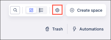
Click Create theme.
Configure your brand identity setting:
Theme Name: Enter a descriptive name in the New theme field to identify this configuration.
Mode Toggle: Choose between Light mode or Dark mode to set the base appearance of your interface.
Default Setting: Use the Default color theme toggle if you want this specific theme to be the starting point for all new packages in your team. When a global color theme is set as the default, it is used by default whenever a component is configured in a Studio View.
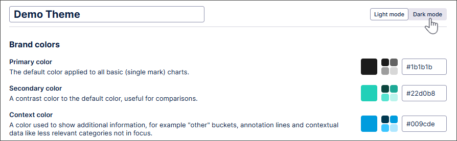
Configure your brand colors: These colors define the core look of your data visualizations:
Primary Color: The main color used for all basic, single-mark charts.
Secondary Color: A contrast color used primarily for comparisons or secondary data series.
Context Color: Reserved for "Other" categories, annotation lines, and background data that shouldn't draw primary focus.
Configure your semantic colors: Use these to give immediate meaning to data trends without requiring a legend:
Positive (Green): Indicates growth, success, or targets met.
Negative (Red): Highlights areas requiring immediate action or declining trends.
Warning (Orange): Signals areas that need monitoring before they become critical.
Configure your additional colors: If your brand requires more variety, you can define up to 3 Custom Colors.
Click Save.
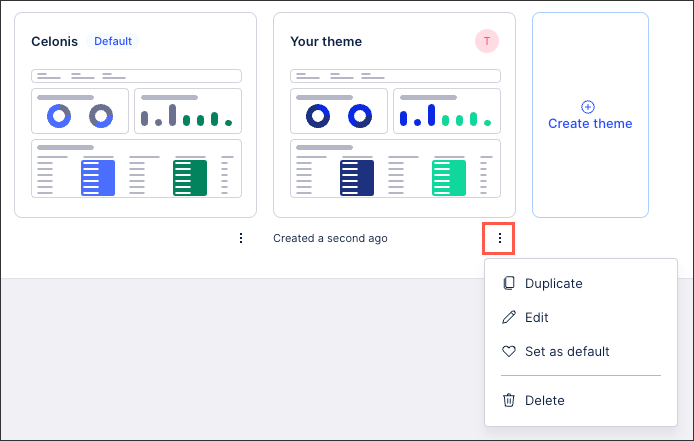
You can then either create additional themes by clicking Create theme or click Options and select to edit, duplicate, set as default, or delete.
 |
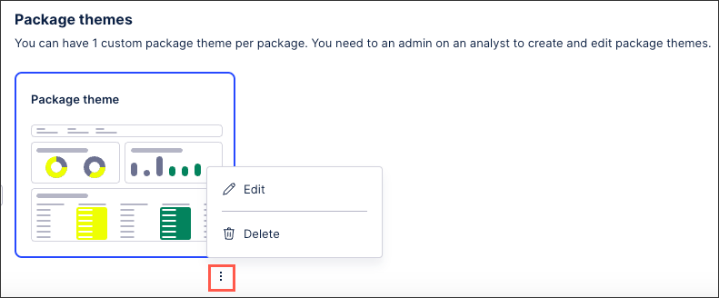
In addition to creating or selecting an existing global theme, you can also create one custom package theme to use.
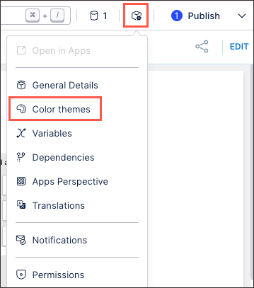
When viewing your Studio package or editing a View, you can access your global and package color themes by clicking Settings - Color themes:
After creating a package color theme, it can then be edited or deleted as appropriate:
You can also switch between light and dark modes here:
 |
If the brand colors used in dark mode aren't suitable, you can change them here. This helps ensure your custom brand color themes remain readable even when users have dark mode enabled.
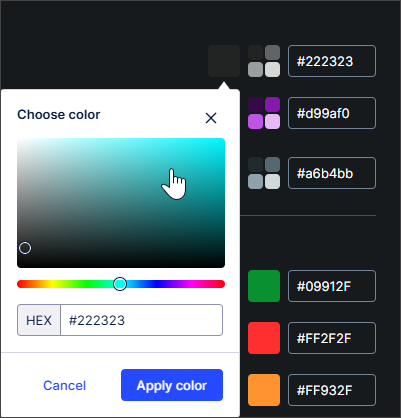 |
The dark mode colors match light mode by default. Users can manually override these colors to provide better contrast or visibility against dark backgrounds.
You can add colors to the data displayed in your table columns using gradients, thresholds, or categorical colors. These coloring options allow you to configure which color is used for specific values or a range of values.
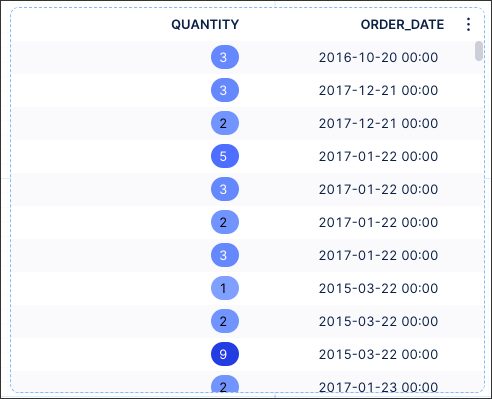
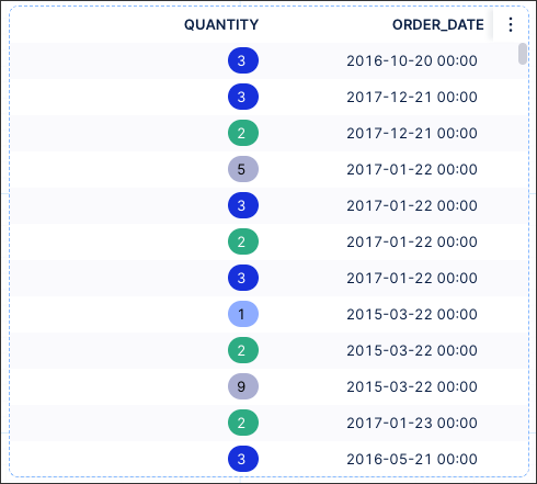
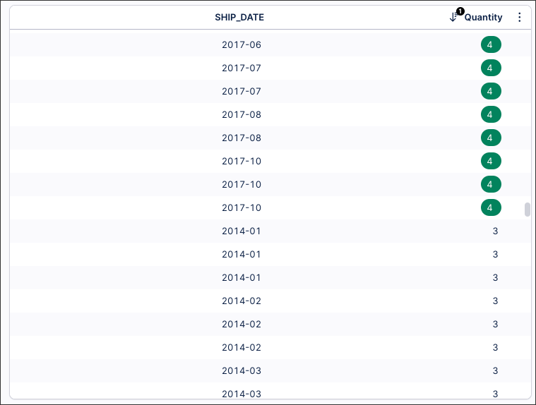
For example, this table is configured to highlight any quantities considered above the average quantity (4). As a result, the quantities 4 or above are colored green.
 |
To learn how this is configured within a View, see: Example of conditional table column coloring.
You can choose between gradients, thresholds, and categorical colors for your table columns:
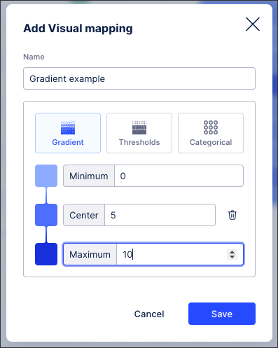
Gradient coloring
By using gradient coloring for your columns, you can choose how your values are colored based on their relation to the minimum, center, and maximum values in the range:
 |
With the example table looking like this (based on highlighted value coloring):
 |
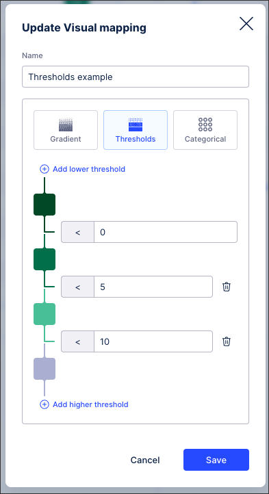
Threshold coloring
By using theshold column coloring, you can select the values at which your column values change colors. You configure this by adding threshold levels, with the value changing color once it is this value or higher:
 |
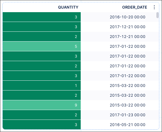
With the example table looking like this (based on background value coloring):
 |
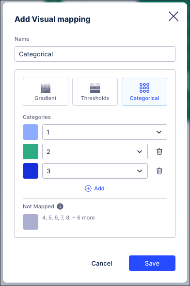
Categorical coloring
When using categorical column coloring, you can assign a color to each category or value in the table column. You can configure specific colors per category / value and choose the color for anything that isn't mapped:
 |
With the example table looking like this (based on highlighted value coloring):
 |
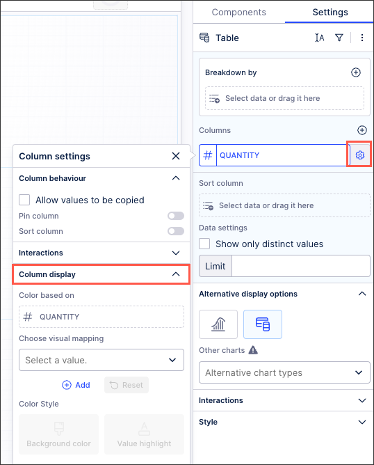
To add colors to your column:
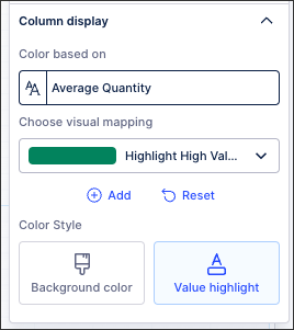
From your table component settings, click the column settings icon and then expand the Column display section:
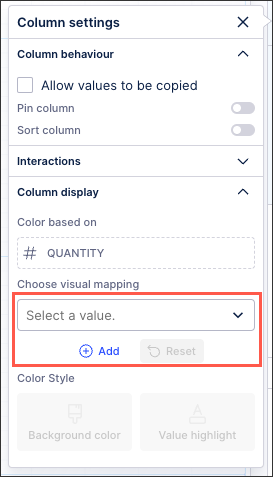
Choose between either selecting an existing value or creating a new color map:
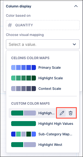
Select a value: Choose between either Celonis Color Maps or edit or use Custom Color Maps:
To edit or delete a Custom Color Map, hover over the row:
Add new color map: Choose your colors based on gradients, thresholds, or categorical. See: Gradients, thresholds, and categorical column colors
Select whether this color should be used to highlight the value inside the cell or be a background color for the cell.
Save your View.
In this example table, the coloring of the columns is based on the "Average Quantity" (which is 4 in this data set). The table is configured to highlight all values in the table that are higher than the global average. Anything value lower, such as when the quantity is 3, is left uncolored:
 |
This is achieved by adding the 'Average Quantity' column to the PQL statement:
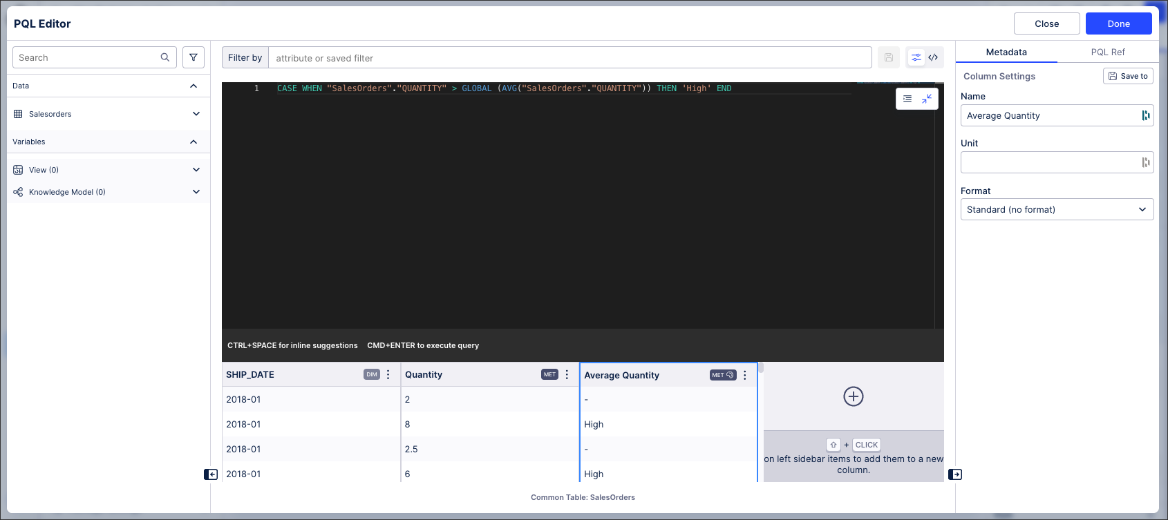 |
The PQL statement for this is:
CASE WHEN "SalesOrders"."QUANTITY" > GLOBAL (AVG("SalesOrders"."QUANTITY")) THEN 'High' ENDThis column display is then configured as follows:
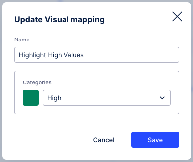
With the Highlight High Value custom color map being configured as:
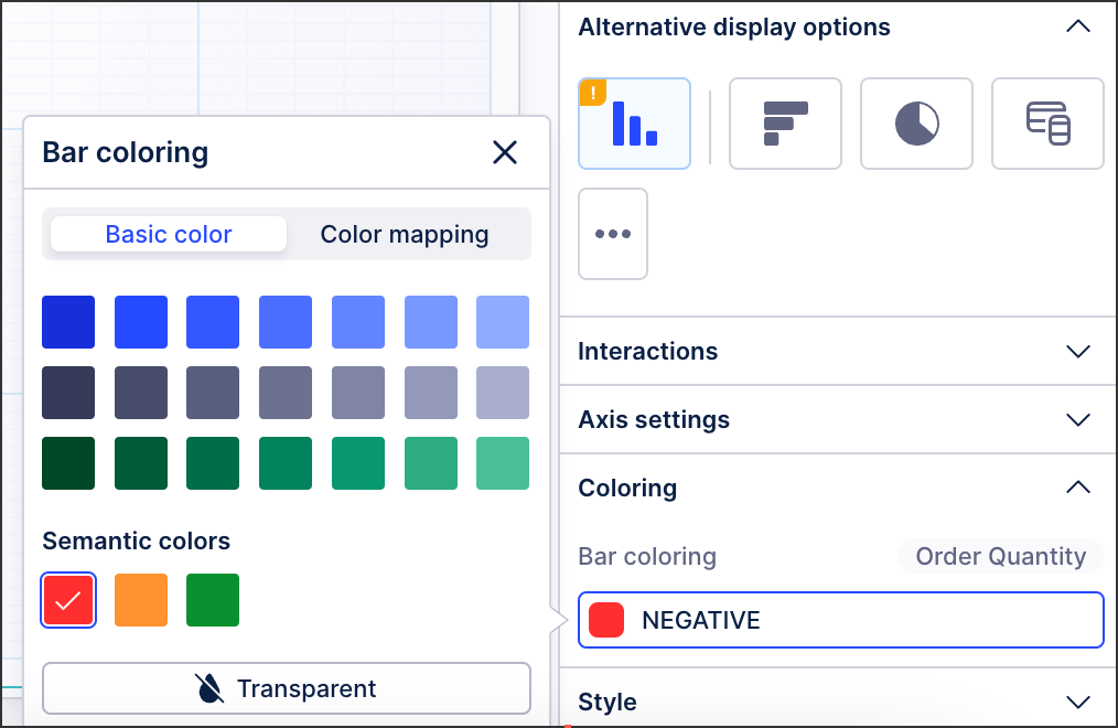
You can configure the color of your bars, columns, and slices in your charts, helping you to visually display and highlight your data in a range of colors.
Without configuring your color themes, you can use a Celonis color palette for your Studio content. This color palette includes a range of primary, secondary, context, and semantic color shades.
 |
Configuring chart colors
Chart colors are currently configured at a component level when in View edit mode.
To configure your chart colors, click the chart component and then select Settings - Coloring:
 |
Note
If you can't see the Coloring section for your chart type, you need to configure your dimensions or metrics. Once these are configured, the coloring settings can then be applied to them.
Depending on your chart type, you can then choose between basic coloring and color mapping:
When selecting your basic chart coloring, this displays all bars and columns in the same color.
In this example, all bars in this chart are colored green:
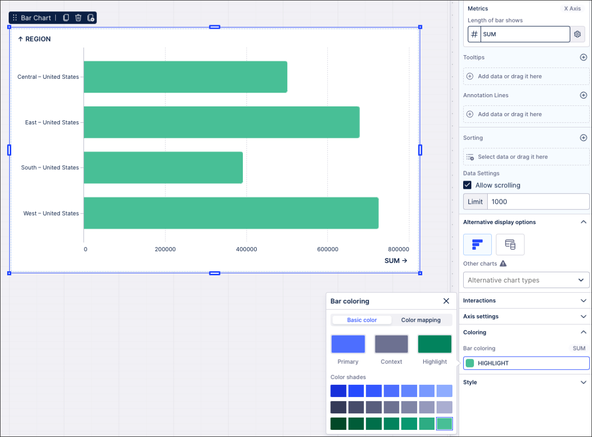 |
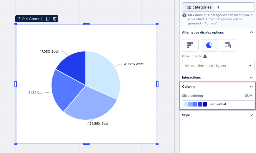
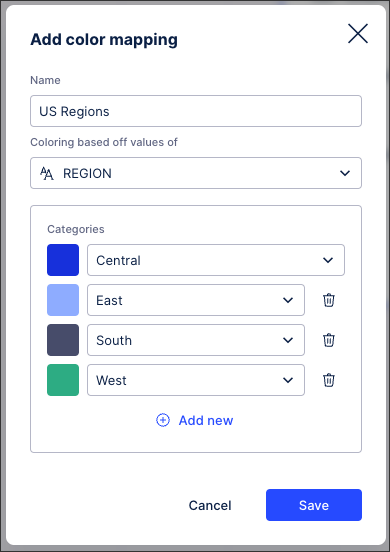
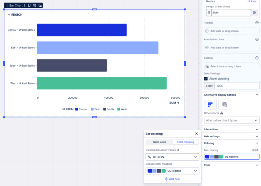
When choosing color mapping for your chart, you can configure a color for each bar, column, or slice that's displayed. This involves mapping colors to chart dimensions and metrics (taken from your knowledge model).
You can configure your color mapping based on categories (for dimensions), gradients (metrics), and thresholds (metrics):
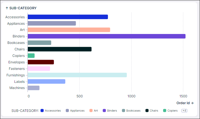
In this example, the chart is configured to show each category (in this case US regions) in a different color:
 |
The chart then displays like this:
 |
Color is a critical factor in determining the effectiveness of an app for its users. Creating effective color themes for data visualizations is essential for ensuring clarity and readability. Here are some best practices to help your brand identity shine through while maintaining the usability of your visualizations.
Choosing effective colors
Studio color themes are designed to give meaning to the selected colors, ensuring consistency in their application. Here are some key considerations when choosing each color option:
Brand colors: These will be used most frequently across your view. For each brand color, we automatically generate 10 shades that can be used to show continuous data or emphasize trends and patterns in your data.
Primary color: This is the most important color you will choose for your theme, as it will be used as the default color in all visualizations. While most companies choose their primary brand color, it is important to avoid colors that are too saturated or bright, as they can be overwhelming. If necessary, use another brand color or adjust the saturation or brightness of your chosen color.
Secondary color: Choose a secondary color that stands out against the primary color, providing clear differentiation. If you're unsure which color to use, start with the complementary color to your primary color. The Adobe Color Picker can help you find this.
Context color: We highly recommend using a gray color for context. As seen in the examples below, combining gray with a more saturated color is an effective way to highlight key information. Use gray to show less important, missing, or contextual data in your visualizations.
Positive/Negative/Warning colors: These colors indicate trends in the data. Common choices are green for positive, red for negative, and orange for warnings. However, using green and red together can be difficult for color-blind users to differentiate. To create a color-blind-friendly palette, consider using blue instead of green to make the distinction clearer.
Building accessible color themes
Creating color themes that are accessible to users with color blindness is crucial for inclusivity. If it’s not possible to make your default color theme color blind safe, consider supporting a color blind-friendly theme that can be used in certain packages if needed by the end users.
Here are some tips to ensure your visualizations are color-blind-friendly:
Avoid problematic color combinations: Red-green color blindness is the most common, so avoid using red and green together. Instead, use combinations like blue and orange, which are more distinguishable.
Leverage lightness and saturation: Differentiate colors by varying lightness and saturation levels. Even if two colors are perceived similarly, differences in brightness can help distinguish them.
Test your color themes: Use color blindness simulators to test how your visualizations appear to users with different types of color blindness. Tools like this VIZ Palette Checker by Elijah Meeks & Susie Lu can help you ensure your colors are colorblind friendly are accessible.
Applying colors to components
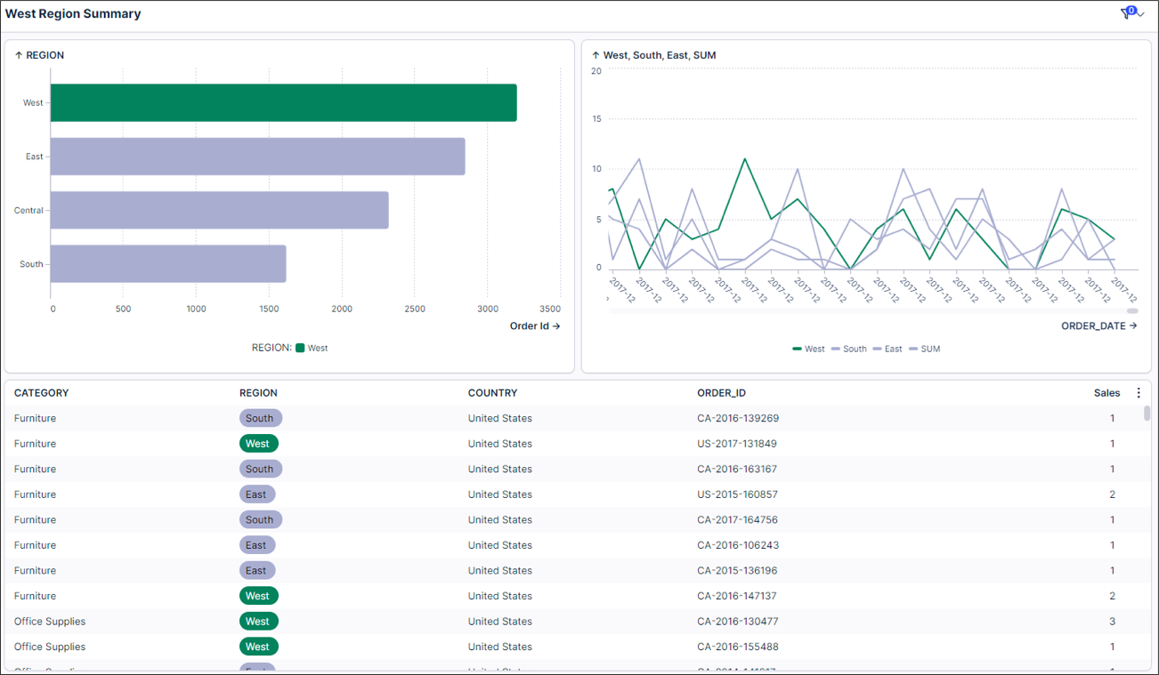
Don’t change the meaning of colors across Views - be consistent: Color mappings make this even easier to accomplish, as you only need to define a rule once and then you can reuse it in all components that support coloring.
Good example: In the example below, we provide a summary of the performance of the West Region. We've highlighted this region with the same color in each visualization, making it quick and easy to differentiate it from the others while still observing how it trends compared to the other regions
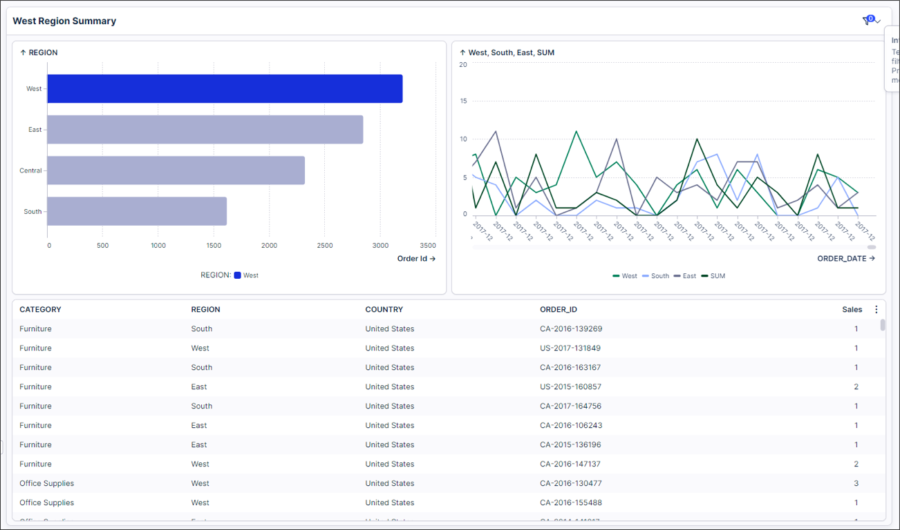
Bad example: In this example, the West region is highlighted in two different colors within a single view. This makes it really hard to identify where I should be looking in each visualization.
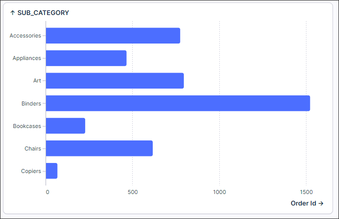
Less is more: Simplifying colors allows for focused user engagement and prevents overwhelming distractions, resulting in more effective and impactful visual experiences.
Good example: Since there are no categories we want to highlight here in this example, it is better to keep all bars as one consistent color.
Bad example: Coloring every bar in this example is unnecessary and can actually detract from the effectiveness of the visualization.
Use color to emphasize or de-emphasize points: While colors can be powerful, they are often overly utilized, making it even more challenging for users to identify insights. Use color to focus attention on what matters.
Good example: In this example, the users' eyes are quickly drawn to the colored bars. The gray color helps make these bars stand out even more.
Bad example: By adding in these additional colors, users need to look at the chart longer before knowing where they should focus, as the focus has shifted.
Sequential color scales often increase comprehension: When coloring continuous categories, gradient colors are often much easier to read than using multiple hues.
Good example: In this example, The gradient color clearly indicates more or less contribution.
Bad example: In this example using hues for each category does not create any value for the user. It becomes harder for viewers to compare slices when they are all different colors. Humans are better at recognizing differences in shades of a single color than interpreting many distinct colors at once.