Configuring KPI cards and KPI lists
When creating your Studio Views, you can display Key Performance Indicators (KPI) from your Knowledge Model as either an individual KPI card or a list of multiple KPIs.
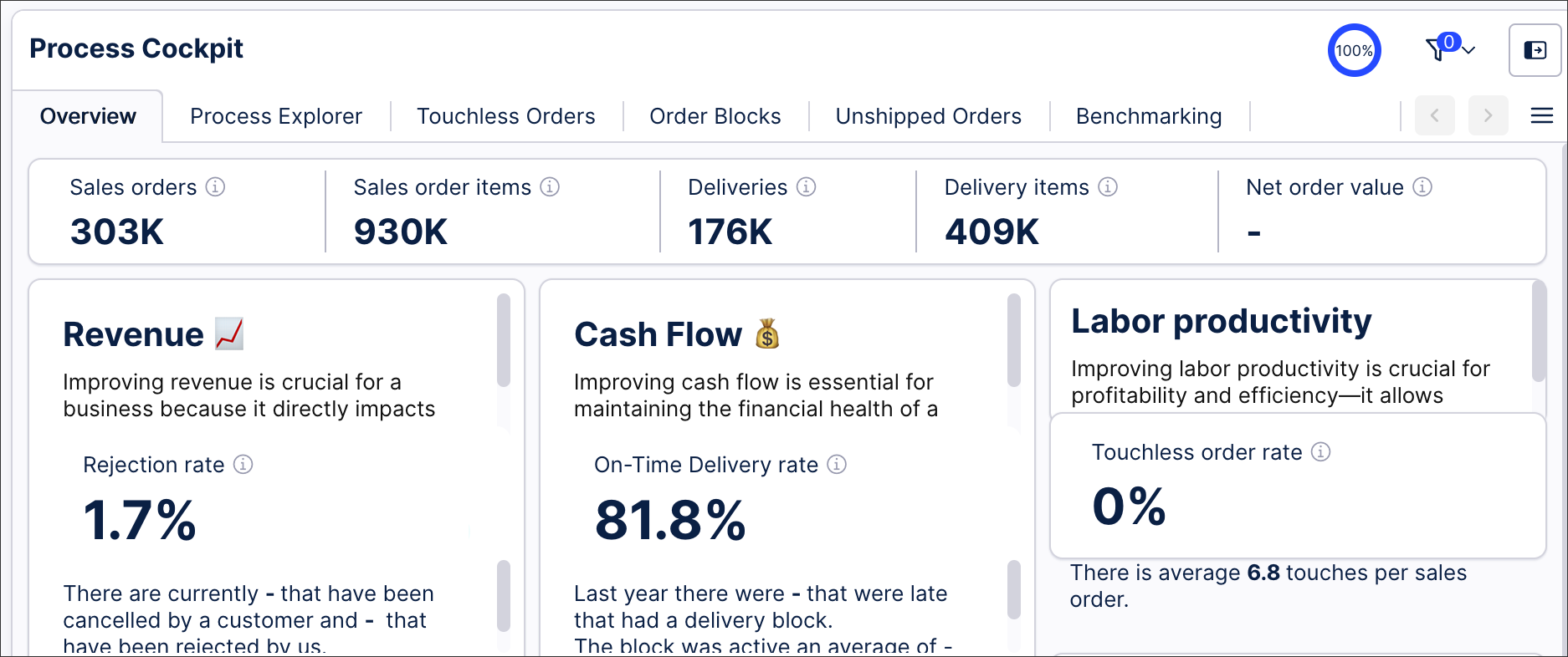
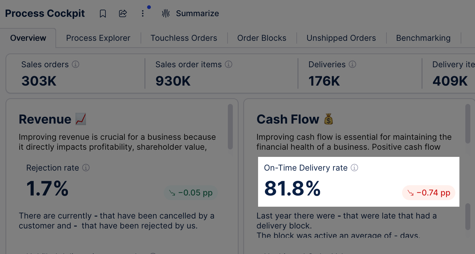
In this Process Cockpit example, there are both KPI cards and KPI lists (with highlighted examples in the sections below):
 |
Note
You can use visual mapping rules for colors and icons in the KPI card and KPI list components. For more information, see Color themes and Icon mapping.
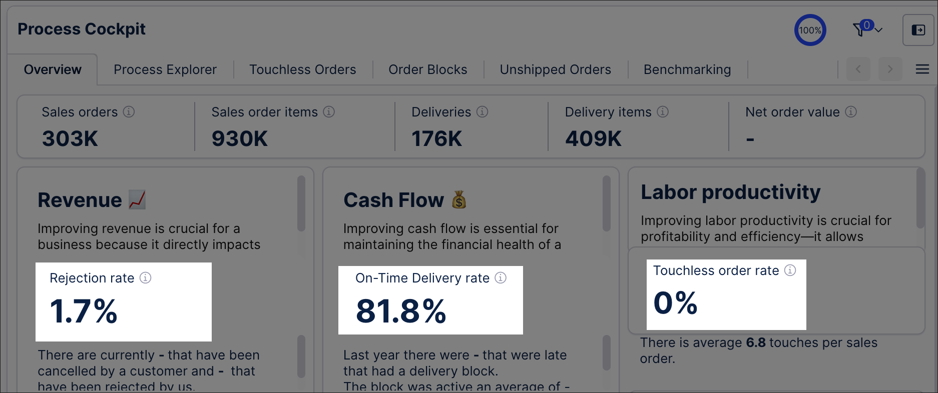
KPI cards allow you to display an individual KPI from your Knowledge Model.
For example, three KPI cards are used in this Process Cockpit to display the rejection rate, on-time delivery rate, and touchless order rate:
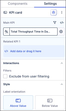
When configuring a KPI card, you have the following options:
Edit PQL statement: This opens up the PQL editor, allowing you to write a PQL statement involving business metrics from your Knowledge Model. You can also use the PQL editor to set the KPI display name, format, and unit of measurement.
Column settings - Information: By clicking the configuration icon, you can write a tooltip for the KPI. This tooltip allows app users to click the info icon and read more about the KPI.
Related KPIs: You can configure additional KPIs to display under the main KPI card, giving app users extra process related context.
Style - Label orientation: This controls whether the KPI label is above or below the KPI itself.
Interactions - Exclude from user filtering: When excluding from user filtering, this KPI will remain the current value regardless of the temporary filters being applied.
 |
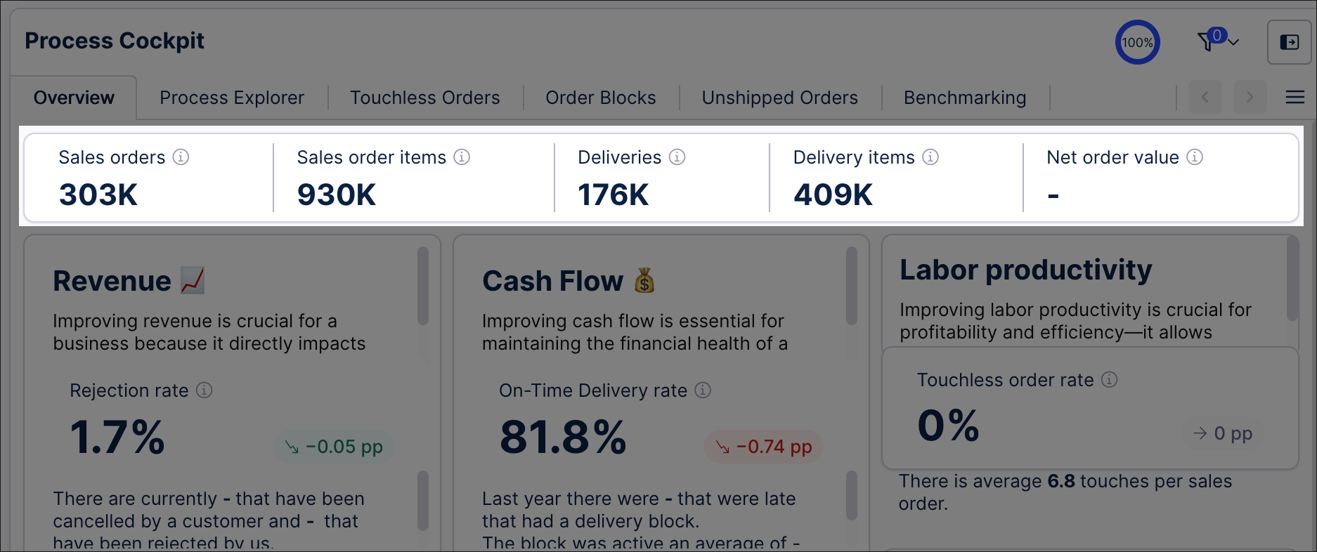
KPI lists allow you to display related multiple KPIs from your Knowledge Model in a horizontal or vertical list.
In this Process Cockpit example, a horizontal KPI list is used to display sales order, sales order items, deliveries, delivery rate, and net order value KPIs:
When configuring a KPI list, you have the following options:
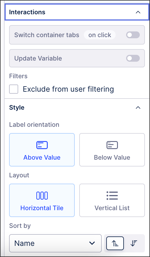 |
Edit PQL statement: This opens up the PQL editor, allowing you to write a PQL statement involving business metrics from your Knowledge Model. You can also use the PQL editor to set the KPI display name, format, and unit of measurement.
Column settings: By clicking the configuration icon, you can configure additional column features:
Trend: Display how the KPI is progressing over time, including setting the time dimension, time range, and how the KPI is comparing against the target value. For an example of a KPI trend, see: Displaying KPI trends in a KPI list
KPI display: Add color to your column by configuring dimensions, visual mappings, and color style. For more about Studio colors, see: Color themes.
Interactions: Configure what happens when an App user clicks on the data displayed in your KPI lists.
Switch container tabs: When clicking on a KPI in the App, the active container can be switched to another within the same View.
Update variable: When clicking on the KPI in the App, you can choose to update a variable that's being used in the same View.
Style: Choose the visual styling for the KPI list:
Label orientation: Controls whether the KPI label is displayed above or below the KPI.
Layout: Select between horizontal or vertical lists.
Sorting: Choose how the KPI can be sorted, including alphabetical (A-Z and Z-A) and numerical (highest-lowest and lowest-highest).
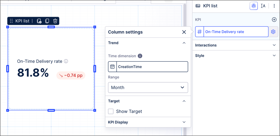
Displaying KPI trends in a KPI list
Using a KPI list component, you can display the trending behavior of the KPI over a time range. To understand how this KPI trend is calculated, see: Calculating the KPI trend.
For example, this On-time Delivery Rate KPI is showing a 0.74pp decline over the last month:
 |
This trend has been configured with the following column settings:
Time Dimension: Using the PQL editor, the example takes the creation time of the sales order item.
The PQL statement for this example is then:
"o_celonis_SalesOrderItem"."CreationTime"
Range: This example uses the Month option, but it could be updated to daily, weekly, or annually.
Calculating the KPI trend
The KPI trend comes from calculating the gradient (or slope) of the linear regression, which is a formula that tries to draw a straight line that best fits a set of data points (which in this case, is the KPI you have configured). The goal of linear regression is to find the best slope and intercept so that the line is as close as possible to the actual data.
Gradient/Slope: The gradient or slope of this line tells you how steep the line is. If the slope is positive, it means your KPI is generally increasing over time. If it's negative, your KPI is decreasing.
Output Numbers: The slope is a number that shows the rate of change. For example, if the slope is two, it means that for every unit of time, your KPI increases by two units. If the slope is -3, it means your KPI decreases by three units for every unit of time.
This feature is currently available as a Private Preview only
During a Private Preview, only customers who have agreed to our Private Preview usage agreements can access this feature. Additionally, the features documented here are subject to change and / or cancellation, so they may not be available to all users in future.
For more information about our Private Preview releases, including the level of Support offered with them, see: Feature release types.
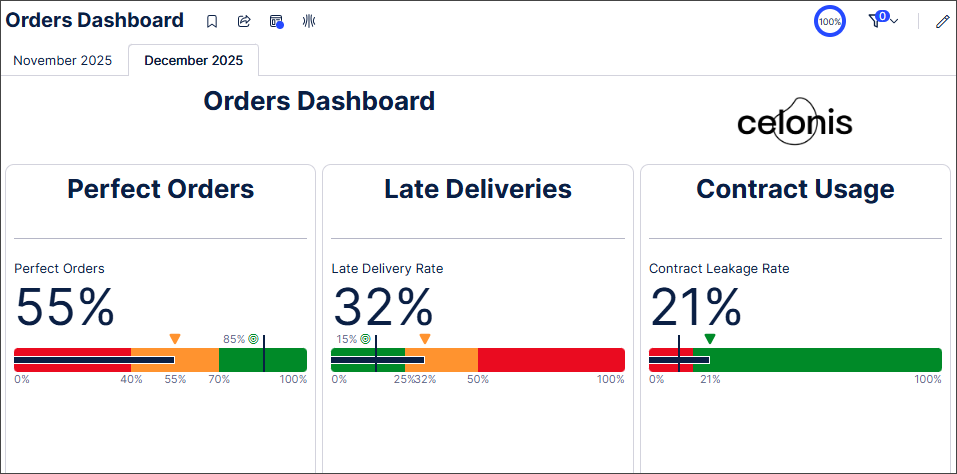
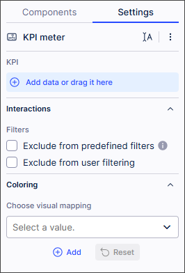
The KPI meter component lets you display the current value of an individual KPI metric from your Knowledge Model on a bullet graph. You can set the different thresholds that display in the bullet graph and customize the colors used to indicate these thresholds. The threshold values automatically display as labels on your bullet graph.
For example, three KPI meter components are used in this dashboard to display KPIs and KPI thresholds for perfect orders, late deliveries, and contract usage.
 |
When configuring a KPI meter component, you have the following options:
KPI: Opens the PQL editor, allowing you to write a PQL statement using business metrics from your Knowledge Model. In addition, you can use the PQL editor to set the KPI display name, format, and unit of measurement.
Tip
You can also select a KPI from the Metrics list in the PQL editor.
Interactions: Lets you select whether the KPI meter component is excluded from predefined and user-applied filters.
Coloring: Sets the colors used in the KPI meter bullet graph, based on predefined options.
+Add: Lets you Add a visual mapping.
 |
Adding a visual mapping
You can customize the colors and thresholds used in your KPI meter bullet graph by adding a visual mapping. You have the following options:
Name: Add a name for your color mapping.
Add lower threshold: Define the value of your KPI lower threshold.
Add higher threshold: Define the value of your KPI higher threshold.
You can add multiple threshold values if required.

This feature is currently available as a Private Preview only
During a Private Preview, only customers who have agreed to our Private Preview usage agreements can access this feature. Additionally, the features documented here are subject to change and / or cancellation, so they may not be available to all users in future.
For more information about our Private Preview releases, including the level of Support offered with them, see: Feature release types.
You can automatically generate Insights in a View containing KPI lists and/or KPI cards. Insights are displayed in order of importance for a selected KPI and you can apply that Insight as a filter to your View. You can add multiple Insight filters and reset them at any time.
In a View, enter edit mode.
In View Settings, select Generated Insights.
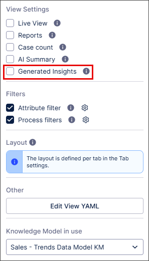
The Generate Insights
 icon is added to all KPI list and KPI card components in your View.
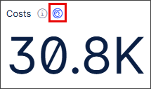
In interactive mode, select the Generate Insights
icon in a KPI list or KPI card component.A list of generated insights appears for that KPI component.
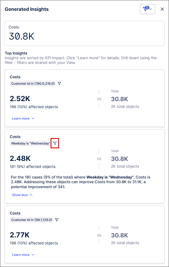
Select the filter icon for an Insight you want to explore.
A preview of the View with the Insight filter applied appears.
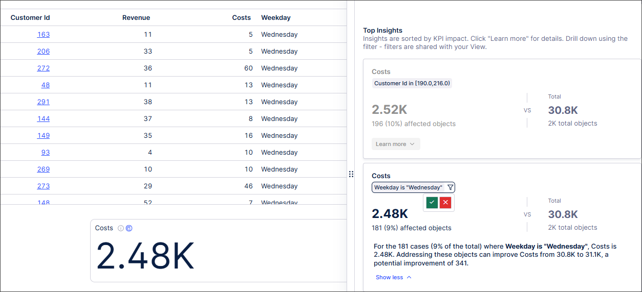
Select Apply filter
 to add the filter to your View.
The View displays with the filter applied.
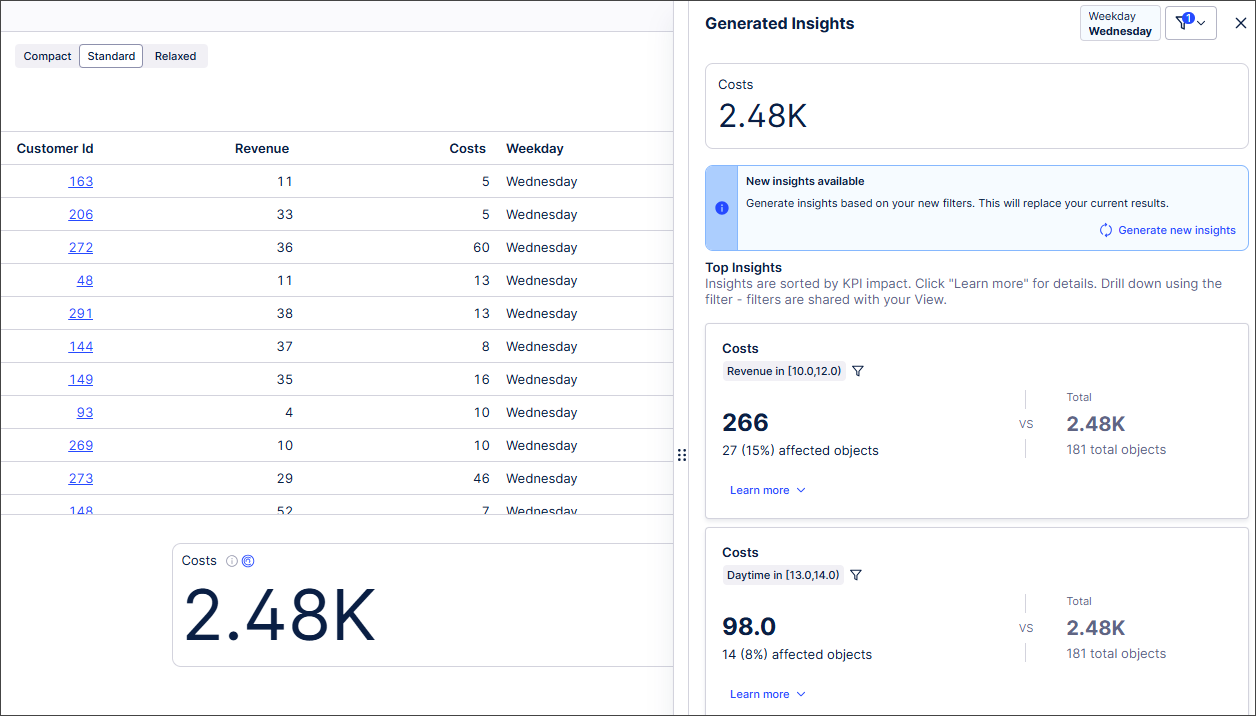
Note
New Insights are generated for your View based on the applied Insight filter. Selecting additional Insights and applying additional filters will help you drill down further into your KPI data.