Configuring a filter bar for your View
When creating and editing a Studio View, you can add a customizable filter bar to your View. This filter bar is configured by adding and configuring individual View components to a collapsible side panel in the View. The filter bar can then be accessed by users in your published apps, helping them to display only the data relevant to them. The filter bar can also be expanded and collapsed on demand by the user, allowing them to decide when it is visible.
When configuring a filter bar, you can embed the following View components:
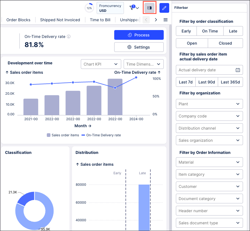
As an example, the following View has a filter bar allowing users to filter data based on classification, delivery dates, organizations, and order information:
 |
To configure a filter bar when editing a Studio View:
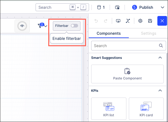
In Edit mode, toggle Enable:
Click into the, opening the component menu:
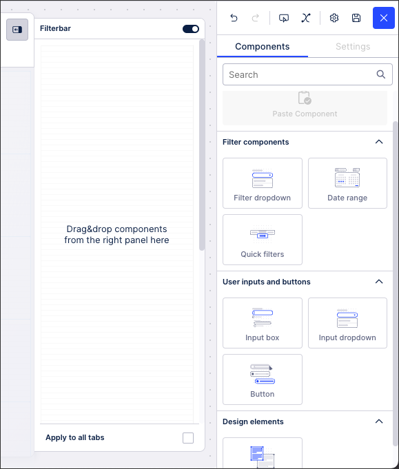
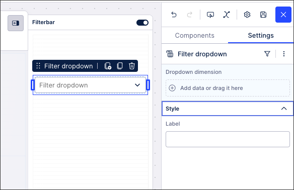
Drag and drop the required components to the filter bar and then use their individual component settings menu to configure how they should function:
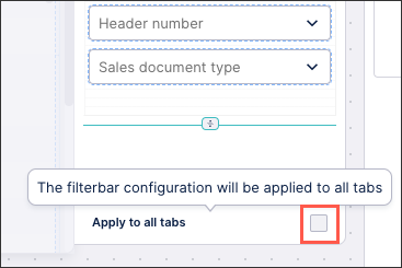
For Views with two tabs or more: Choose whether to apply this filter bar to all tabs within the View or just the tab that you're currently editing.
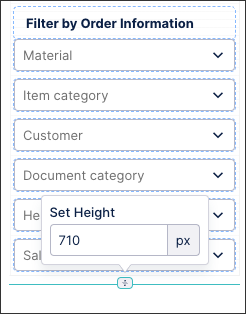
For custom height Views or tabs: You can choose the height in pixels for your filter bar by clicking Specify height. The filter bar height is independent to the custom height of your View or tab, with a longer filter bar being displayed with a scroll bar where necessary.
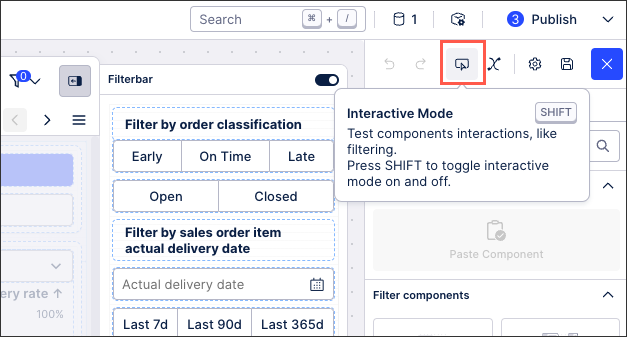
Click Interactive Mode and test your filter bar, correcting any issues you find:
Your filter bar is now configured and will be available to users in previewed and the next published versions of your View.