Adding logos and images to Views
Use of copyrighted or trademarked material
You should only add logos and design marks to your Views that you own the rights to. Unauthorized use of images is prohibited.
You can add logos and images to your Studio Views using the Image component, enabling you to add branding and visual enhancements to your content. You can also customize your image style by choosing options including the fit, background, alignment, labels, and alt text.
You can also reuse the image by uploading it to a View once and making it accessible across all the Views in the package. Images you already uploaded to Analysis will also be accessible through the Views in the same package.
To add an image or logo to your View, you have three options:
Uploading an image: Upload and format one GIF, JPEG, JPG, or PNG up to 2mb in size.
Adding a hosted image: Link to a GIF, JPEG, PNG, or SVG image hosted on a public URL, meaning that it can be accessed without credentials or through specific environments.
Adding Celonis Platform team logos: The Image component automatically displays your Celonis Platform team logo where one is available. This logo is managed in the Admin & Settings area, requiring administration permissions for your Celonis Platform team.
To learn more about changing your team logo as an team admin, see: Team name and logo.
In this example, we've added the Celonis logo to our Process Cockpit app (with the logo managed in the Admin & Settings area):
 |
To add logos or images to your View:
Drag and drop the Image component to the View.
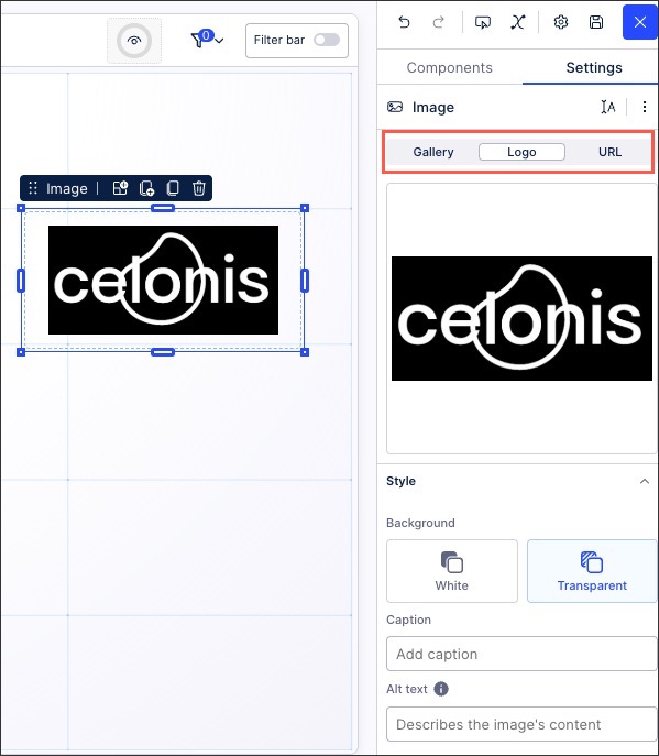
Choose your image source option:
Gallery: Either drag and drop or click to upload a GIF, JPEG, JPG, or PNG up to 2mb in size.
Once the image preview displays, click Done to add the image and configure the styling options.
Logo: Where a team logo exists, it is automatically added to your View.
URL: Add the image source and ensure that the image preview has loaded in your View. If no image is displayed, try accessing the URL through your browser and see if the image loads.
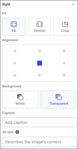
Configure your image style, with your options here depending on the image source selected:
Background: Choose whether the logo is on a white background or a transparent one.
Caption: Add a text based caption to the logo, displayed centrally underneath the image.
Alt text: Add a description or further details about the logo, helping screen readers to describe the image to users with visual impairments. This alt text isn't displayed in the view.
Fit: This is how the image fits into the size and shape of the component (which can be changed by dragging the blue outline to your ideal size). You can then choose between fit, stretch, and crop.
Alignment: This controls where the image is placed within the component, with the default being centered.
Click Interactive Mode and preview your button configuration.
Optional: To see the latest version of your View, deploy the package