Configuring containers, tab containers, and conditional layouts
Containers allow you to visually combine new and existing components in your View, either on a white or transparent background. You can also add multiple tabs to containers with the tab container component, allowing your app users to switch between content dynamically.
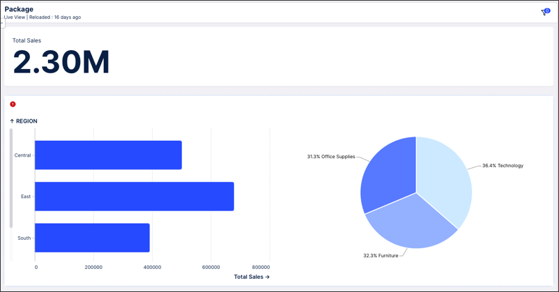
In the following example, a white container has been used to visually combine related column chart and pie chart:
 |
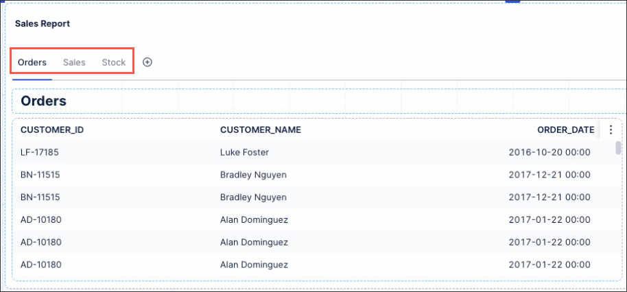
And in this example, a tabbed container has been used to allow app users to switch between Orders, Sales, and Stock information:
 |
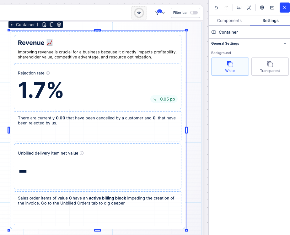
Containers can be dragged and dropped into your View and then resized appropriately. You can then double click the container to add existing or new components to it, grouping them together on either a white or transparent background.
 |
When configuring your containers, the following behavior should be noted:
If the minimum size of a component is larger than the container size, a red warning will be displayed and the container must be resized for the component to be added to it.
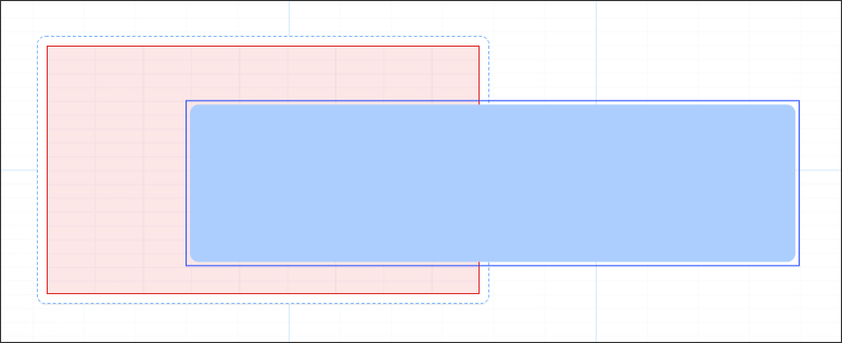
When a container is added on top of existing components, clicking Options - Send to Back doesn't add the component to the container. This only changes the layering of your View, meaning that the component will be displayed on top of the container and not inside it.
Editing container title, info title, and info text
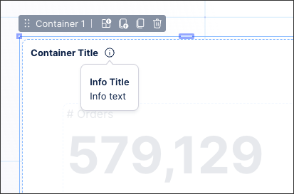
You can edit the container title, info title (tooltip), and info text by clicking the text formatting button within a container.
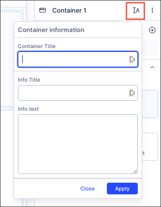
The text then displays on the top left of the container, as shown in the following example:
Using the tab container component, you can add multiple tabs to the same container in your View. After dragging and dropping the tab container component to your View, you can double click into the component to add the other components you want to group together.
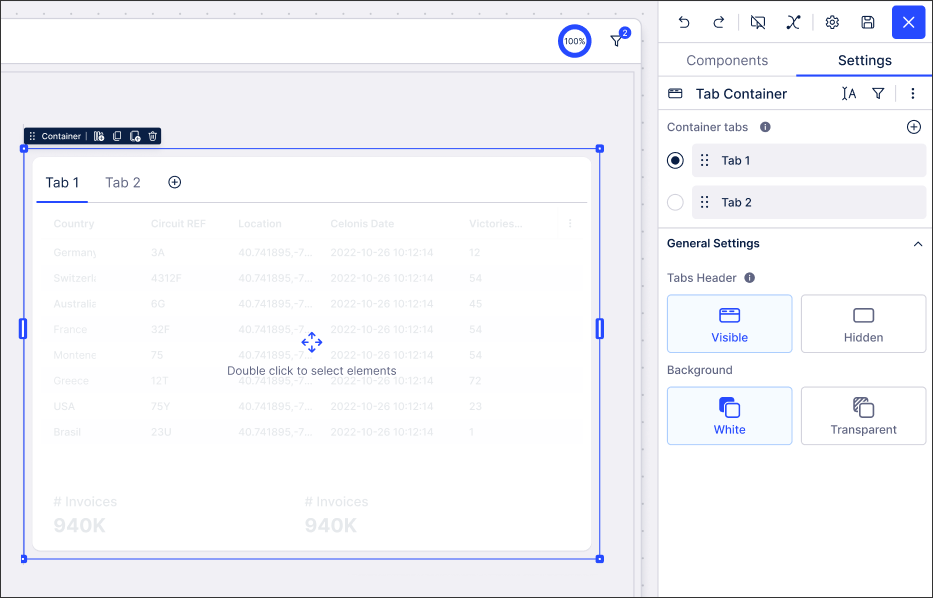 |
You can add tabs, re-order tabs, and rename the tab using the component settings menu:
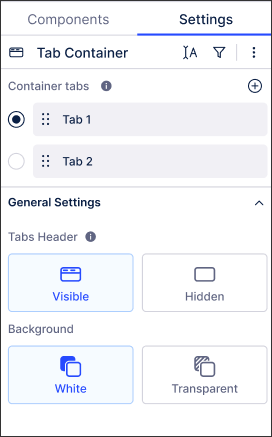
Each tab in the container uses the same General Settings, meaning that all tabs will have visible or hidden headers and all will either be on a white or transparent background.
Tab containers can be linked to other Studio components, such as KPI lists and buttons, to create conditional layouts:
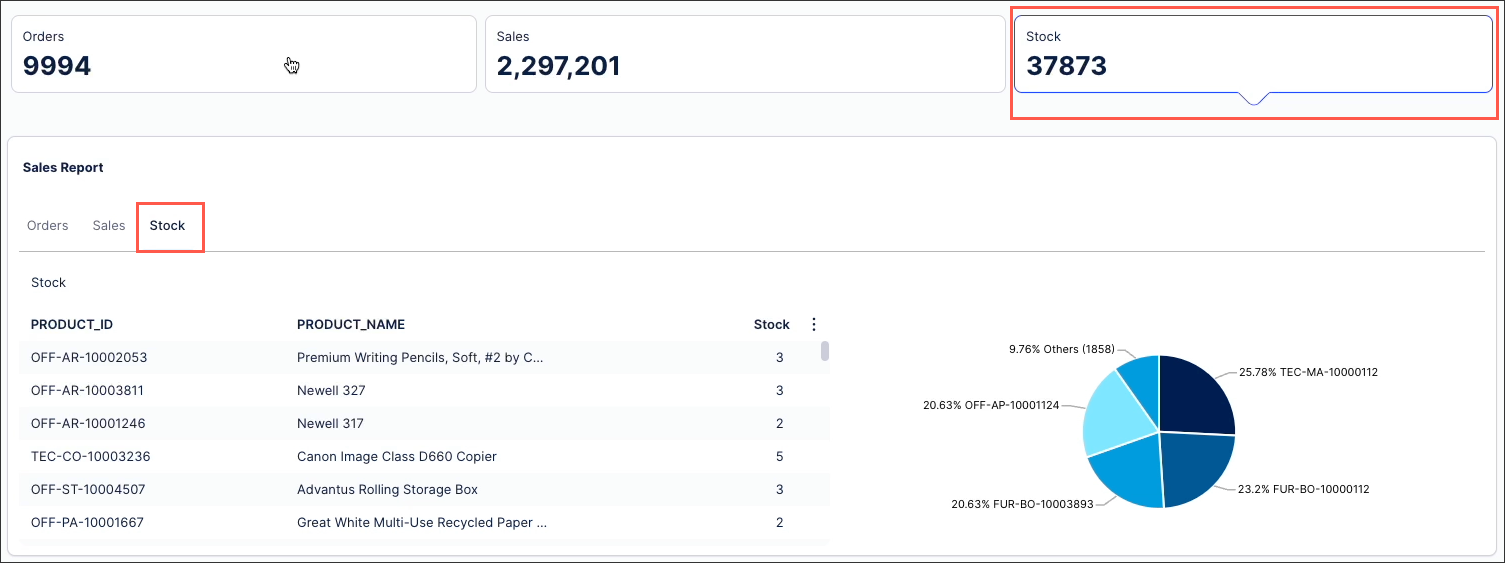
Tab containers can be linked to KPI lists within the same View, allowing app users to click a KPI and switch the tab currently viewed.
In this example, the KPI list is configured to show Orders, Sales, and Stock:
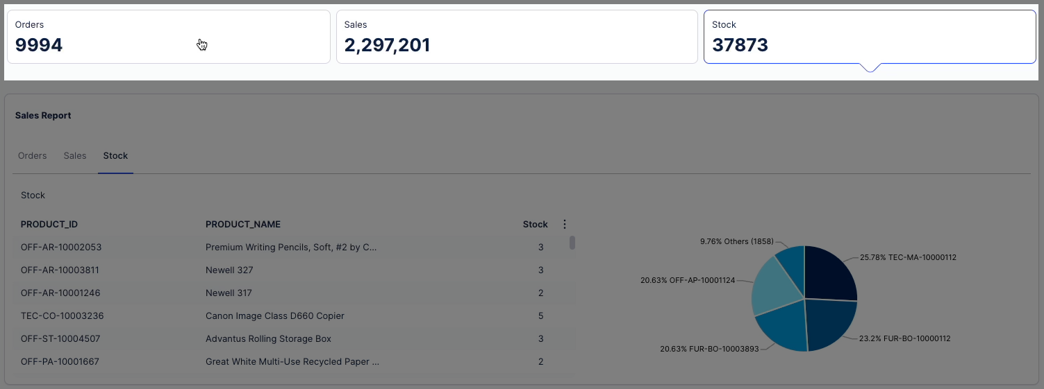 |
This KPI is then linked to the tabbed container below, itself configured to show Orders, Sales, and Stock on separate tabs. When the Stock KPI list is then clicked, the container displays the Stock tab:
 |
To configure a clickable KPI list linked to a container tab:
Add a KPI list to your View and configure the KPIs you want to display.
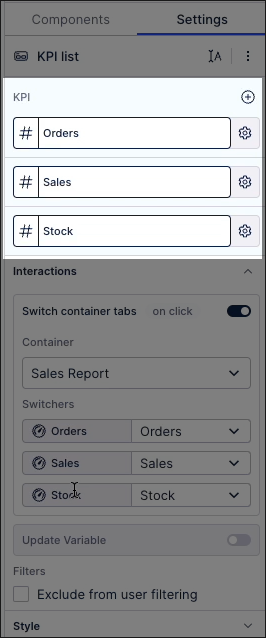
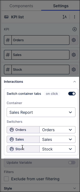
Click Interactions - Switch container tabs and then select the tab container from step 1.
Assign each KPI list to as a Switcher for the relevant tab in the container.
Enter Preview mode and test the clickable KPI list, ensuring that the tab container responds as required.
Save and publish the View to use the clickable KPI list.
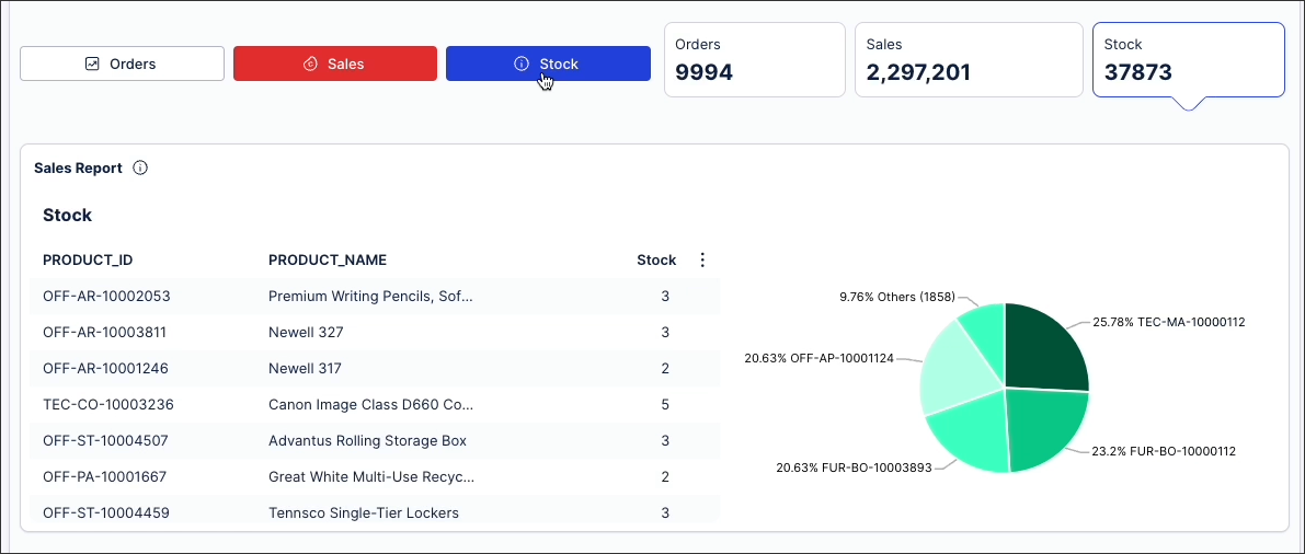
Tab containers can be linked to a button component within the same View, allowing app users to click a button and switch the tab currently viewed.
In this example, three buttons have been configured for Orders, Sales, and Stock. When a button is clicked, such as Stock, the corresponding tab is displayed for the user:
 |
To configure a button linked to a container tab:
For the button component, click Interactions - Switch container tabs and select the container you want to link the button to:
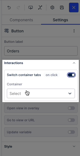
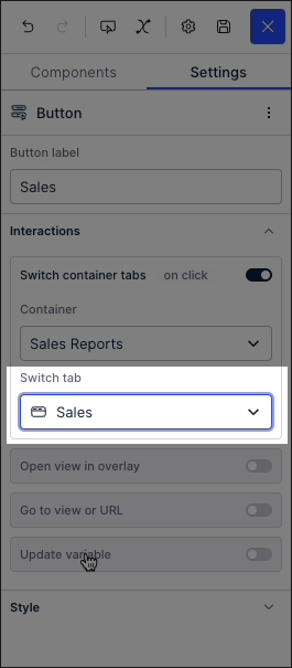
Select the tab within the container that you want to link the button to.
In this example, the container is named 'Sales Reports' and the tab the button activates is named 'Sales':
Enter Preview mode and test the button, ensuring that the tab container responds as required.
Save and publish the View to use the clickable button.
You can configure the types of interactions a user can have with your container. By default, your container can be filtered by users and used to set filters.
Exclude from pre-defined filters: When enabled, this removes the component from any filters that are set on a View and tab level.
Exclude from user filtering: When enabled, this prevents the app user from apply a temporary filter to the data within the component.
Can't be used to set filters: When enabled, this prevents the app user from using the component to set temporary filters for the whole View.