Available chart types
Charts allow you to visualize and analyze your process data based on comparisons between categories, over a time period, and by frequency distribution. Charts can be added to your Views and configured to suit your data and use cases.
For an overview of how to create charts, see: Charts.
When creating Views in Studio, you can add and configure the following chart types:
These types of charts are used to show categorical information, allowing for easy comparisons, identifying patterns, and exploring relationships within the data.
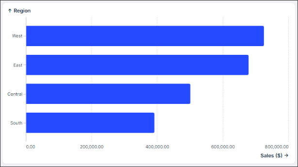
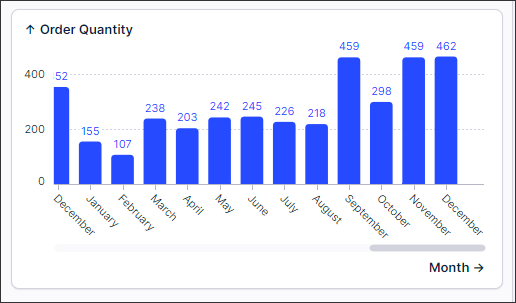
Bar
A Bar chart is the simplest version of a categorical chart. It offers a clear visual representation that facilitates easy comparison between different categories, making trends and patterns readily identifiable.
The categorical bar chart is horizontal because it can more easily support longer category labels without overcrowding labels and bars. The horizontal bars also more naturally emphasize the values represented by the length of the bars. While we don’t recommend it, you can still use categorical data in the vertical column chart as well.
Minimum data required: 1 x categorical dimension, 1 x metric.
 |
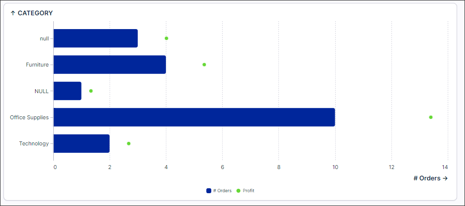
Bar and Point
Choose a bar and point chart when you have two metrics and want to compare values across different categories. You can also do this even when your metrics have different scales by using the dual axis capability.
Minimum data required: 1 x categorical dimension, 2 x metrics.
 |
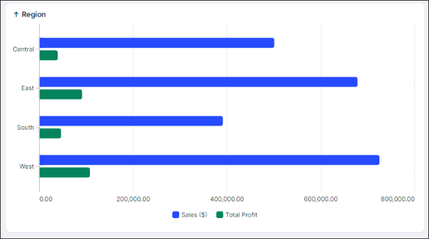
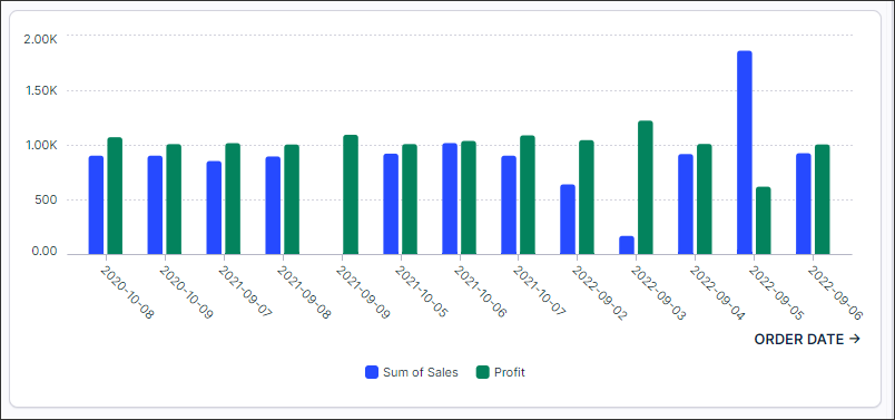
Grouped Bar (multiple metrics)
Choose a grouped bar chart with two metrics when you want to compare the values of two metrics across different categories, maintaining clarity in distinguishing between the metrics.
Minimum data required: 1 x categorical dimension, 2 x metrics.
 |
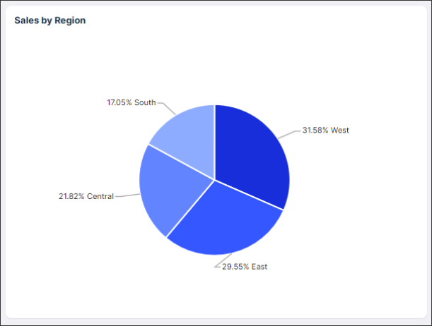
Pie and Donut
Pie charts can be great when you want to display simple data distributions with a few categories and emphasize the proportions of each category relative to the whole.
Tip: Pie charts can become very hard to read if you have too many slices. If you need more than 5 slices then a bar chart would be a better visualization for you.
Minimum data required: 1 x categorical dimension, 1 x metric.
 |
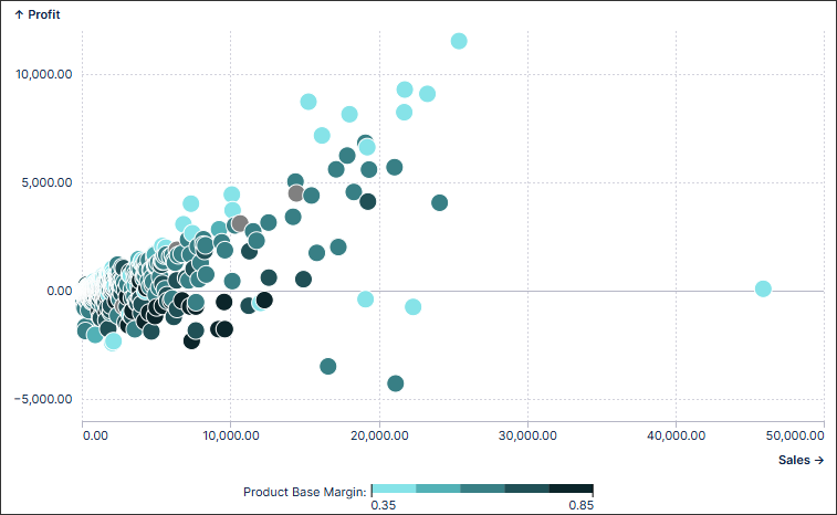
Scatter plot / bubble
Scatter plot and bubble charts are a great way to display a lot of related data in one chart. In scatter plot charts, the x-axis displays one numeric field and the y-axis displays another, making it easy to see the relationship between the two values for all the items in the chart. In a bubble chart, a third numeric field controls the size of the data points.
Minimum data required: 2 x data fields (either dimension or metrics)
 |
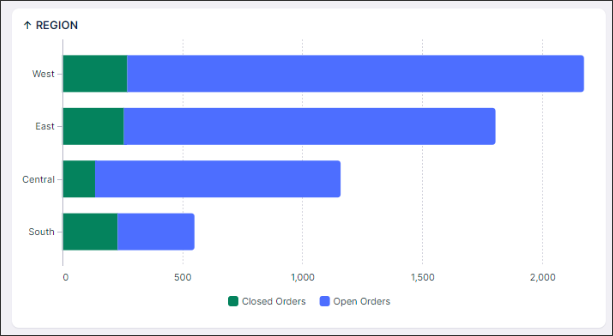
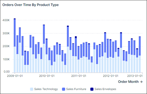
Stacked Bar (multiple metrics)
Stacked bar charts with two metrics are useful when you need to visualize the composition of a whole (total) in relation to two different contributing factors.
Currently, you can only sort each KPI individually. Sorting based on the total bar length is coming soon.
Minimum data required: 1 x categorical dimension, 2 x metrics.
 |
Time series charts display data points or values along a continuous time axis. They usually help show how a particular KPI(s) has changed over time. All time series charts are based on a horizontal axis because it aligns with the natural progression of time from left to right.
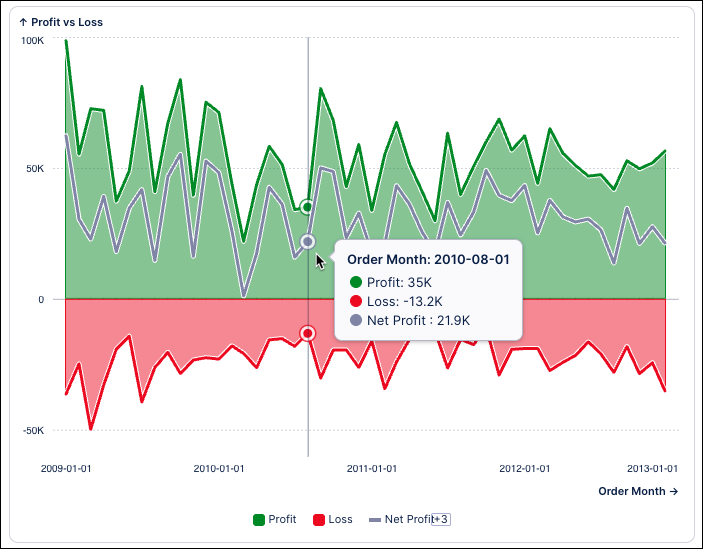
Area
An area chart visualizes quantitative data across a continuous dimension, such as time, by filling the area beneath a line to emphasize the size of the values. It works like a line chart but highlights the data through shading, making trends and cumulative changes easier to see.
Minimum data required: 1 x dimension, 1 x metric.
 |
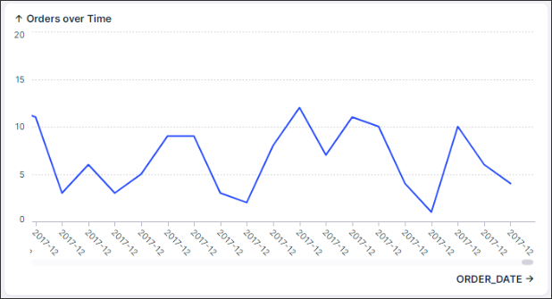
Line
A line chart is the best time series chart to understand continuous trends.
You will notice that you can not sort a line chart. This is intentional since this type of chart is a time series chart, meaning that it is intended to visualize how a metric changes over time. So, introducing sorting could potentially distort the representation, leading to zigzag patterns and undermining the clarity of the data.
Minimum data required: 1 x time dimension, 1 x metric.
 |
Column
A column chart is another option for illustrating changes in a metric over time. Column charts are best suited when you want to emphasize the value of each individual column rather than the overall trend.
Unlike line charts, in column charts, it's important to include 0 on the Y-axis. This is because the length of each column directly corresponds to the magnitude of its data point. Including 0 ensures that viewers can accurately compare the lengths of the columns and make meaningful comparisons.
Tip: Avoid using the vertical bar chart for categorical dimensions. We naturally read time data from left to right, therefore it is better to use column charts over bar charts for these cases. Check out bar charts for better category-based visualizations.
Minimum data required: 1 x time dimension, 1 x metric.
 |
Stacked column
Stacked column charts with two metrics are useful when you need to visualize the composition of a whole (total) in relation to two different contributing factors over time.
Minimum data required: 1 x time dimension, 2 x metrics.
 |
Group column
Choose a grouped column chart with two metrics when you want to compare the values of two metrics across different categories, maintaining clarity in distinguishing between the metrics over time.
Minimum data required: 1 x time dimension, 2 x metrics.
 |
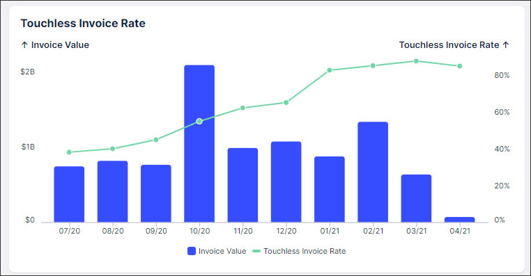
Column and line
Column and line charts are best to use when showing a relationship over time between an amount (column) and a rate (line).
Minimum data required: 1 x time dimension, 2 x metrics.
 |
These chart types allow you to display the distribution of data cross a range.
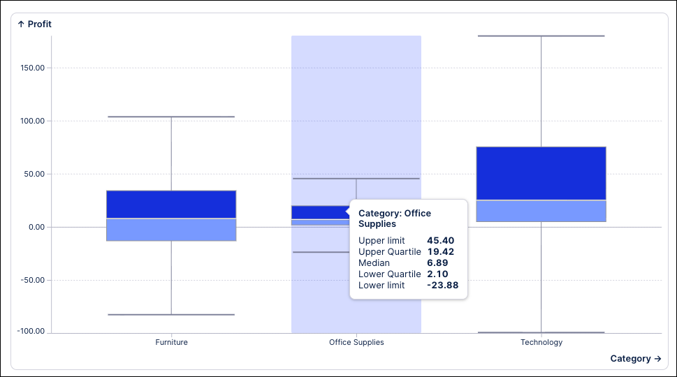
Boxplot
A boxplot chart (sometimes called a box-and-whisker plot) visualizes the distribution of numerical data, making it especially useful for comparing multiple groups. Boxplot charts offer a quick, high-level view of a dataset’s symmetry, skewness, spread, and outliers. With a glance, you can see where most of the values cluster and easily compare patterns between different groups.
Minimum data required: 1 x dimension, 1 x metric.
 |
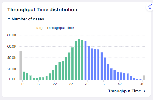
Histogram
Histograms are best used when you want to understand the distribution or frequency of data within a continuous range, such as cycle times, defect rates, or the number of days past a due date.
Minimum data required: 1 x numeric dimension.
 |
This feature is currently available as a Public Preview only
During a Public Preview, only eligible customers can access this feature. Additionally, there may be minor updates to the functionality and design of these features when they are released in General Availability.
For more information about our Public Preview releases, including the level of Support offered with them, see: Feature release types.
Vega component charts are used for advanced analytical requirements that aren't covered by the other chart types. For more information, see Vega component charts.