Sankey chart component
A Sankey chart (or Sankey diagram) is a type of flow diagram in which the width of the arrows (or paths) is proportional to the flow quantity they represent. Sankey charts are useful for visualizing how resources, information, or data move through a process, and where losses, inefficiencies, or splits occur.
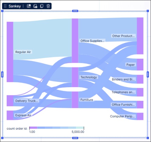
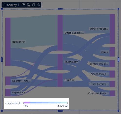
In Studio Views, Sankey charts are configured using at least two dimensions and one metric (connector width). In this example, a Sankey chart is configured to track the shipping mode used for orders of each product category.
This is configured using:
Dimensions: Ship mode, Product category
Metric: Order count ID
Using a Sankey chart in your Studio Views can bring the following benefits:
Process flow clarity: Sankey charts make it easier to understand how a process behaves end-to-end. You can immediately see major pathways and bottlenecks. If one branch suddenly narrows (indicating a drop in flow), you can pinpoint where issues or delays happen.
Track volume or frequency: Sankey charts can show how often different paths are taken, which helps with optimizing workflows.
Compare variants: Sankey charts help identify process variants—like where users deviate from the standard process—and how frequently each variant occurs.
To configure a Sankey chart for your Studio View:
In View Edit Mode, drag and drop the sankey chart component into your View.
Open the component settings menu and customize your configuration using the following options:
Exclude from pre-defined filters: When enabled, this removes the component from any filters that are set on a View and tab level.
Exclude from user filtering: When enabled, this prevents the app user from apply a temporary filter to the data within the component.
Can't be used to set filters: When enabled, this prevents the app user from using the component to set temporary filters for the whole View.
First dimension: Use the PQL editor to add the dimension displayed on the left of the chart. In our example, we've selected the shipping mode used for orders.
Second dimension: Use the PQL editor to add the second dimension, the one that runs from the first dimension configured. In our example, we've selected the product category.
Connector width shows: Using the PQL editor to configure what the width of each connector / bar shows in your Sankey chart. In our example, we've selected the volume of orders received per shipping mode / product category.
Additional dimensions: You can include additional dimensions, which will be displayed as additional nodes for added context. In our example, we've included the product sub-categories.
Data settings: Choose how many categories you want to display in your chart. In our example, we've limited this to 5 categories.
Alternative display options: Based on your configuration, you may be prompted to try displaying your data using other Studio component types. If you select an alternative type, any configurations made to your Sankey chart component will be reset to default.
Interactions: Enable and disable whether users can set temporary filters when interacting with that component. For more information, see: Temporary filters for Apps.
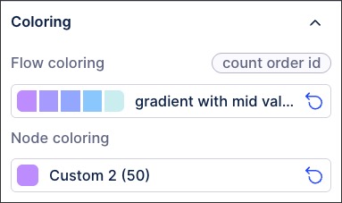
Coloring: Select the colors for each of your metrics. For recommendations on effective colors, see: Studio coloring best practice.
Style: Choose whether the legend is displayed or hidden from app users. For example, this chart includes a legend showing the order count volume:
Click Interactive Mode and preview your chart configuration.
Optional: To see the latest version of your View, deploy the package.