Creating and configuring Views
In Studio, Views are package assets used to build interactive app dashboards. Using a grid-based editor, you can drag, drop, and configure components to visualize your data. This interface includes built-in tools for tab management, screen-size optimization, and version control (undo/redo) to ensure a seamless building experience.
Views transform static data into an interactive workspace. Through features like Interactive Mode and View Variables, users don't just "see" the data; they can simulate scenarios, filter down to specific root causes, and trigger actions directly from the interface, closing the loop between insight and execution.
View size limits
To ensure your apps remain lightning-fast, Studio Views have a 3MB configuration limit.
To avoid being impacted by this limit, we recommend the following best practice: Optimizing your Views.
We also have a number of app building guideslines available: App building guidelines.
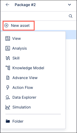
To create a View asset within a Studio package:
Click New asset - View:
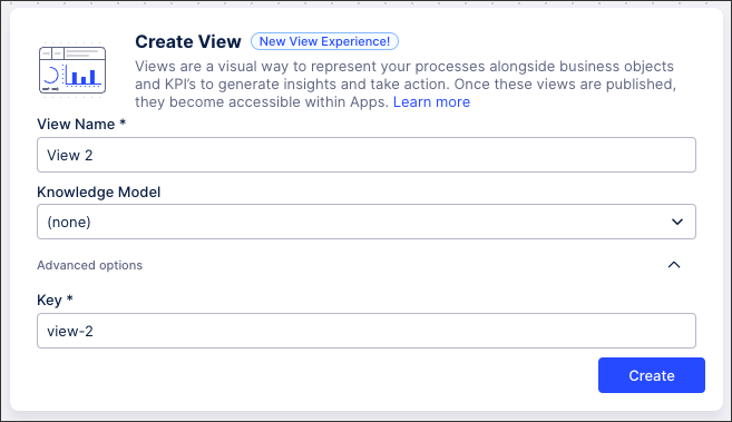
Add a View name, choose a knowledge model to base the View on, and then copy or edit the View key.
A View key is a unique ID for the asset, allowing it to be referenced throughout the Celonis platform.
Note
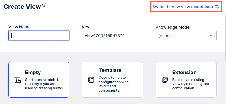
The new View layout features are used by default whenever you create content using the new Studio experience.
If you have chosen to continue using the old Studio experience but would like to create a View using the new View layout features, click Switch to new View experience:
Click Create.
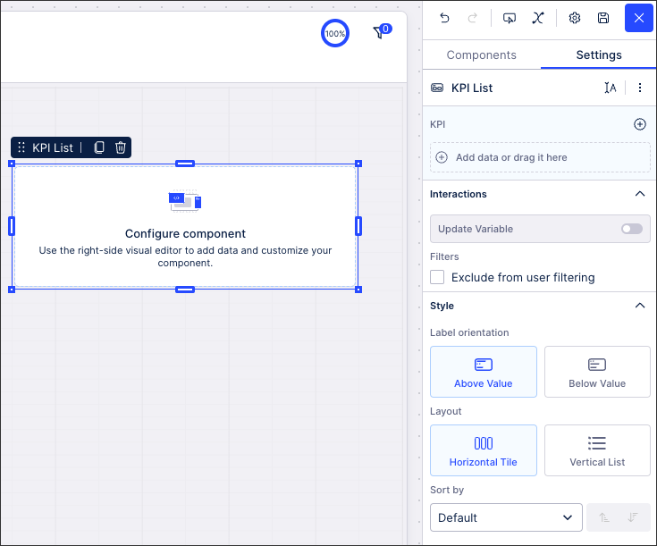
Your View is created and the View layout editing screen is displayed. You can now add components, create tabs, configure filters, and so on.
Components, the main building block of Views, allow you to visualize your process data within your apps. You can drag-and-drop these components to your layout and then re-size and re-order them as you need. For each component, a contextual setting menu is also available. These settings allow you to configure how that component behaves when your package is viewed within an app.
 |
For an overview of available components and how they are configured, see: Components
When editing a View, you have the following options and settings:
Tabs
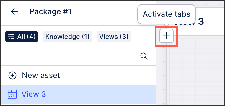
By default, newly created Views are a single tab. To create additional tabs for your View, click + Activate tabs:
To create additional tabs for your View, click + Activate tabs:
 |
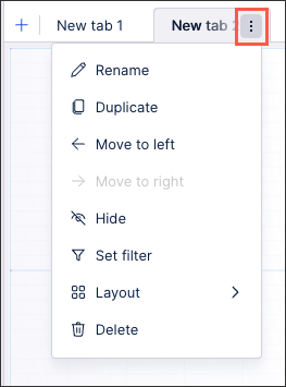
You can then edit the tab settings by clicking the Settings icon:
Filters
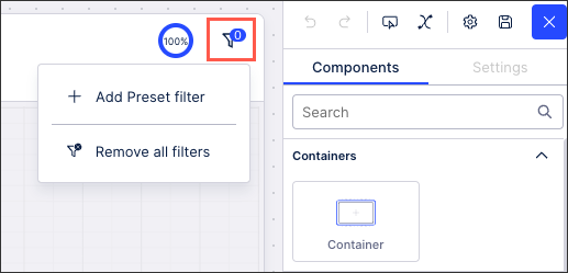
You can add filters to your View, allowing you to configure which data is displayed based on specific criteria.
 |
For more information about configuring predefined filters for your Views, see: Filtering Views.
And to learn how to enable temporary filters for App users, see: Temporary filters for Apps.
Interactive Mode
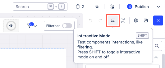
The interactive mode button (or holding SHIFT on your keyboard) allows you to test your View before it is published, giving you the opportunity to see if your filtering and View interactions perform as you expected.
When using interactive mode, your View components can't be edited or resized.
 |
For an overview of how Views are displayed within an app, see: Using Apps.
Variables
Adding variables to your View allows you to change how your data is visualized in different situations or based on specific criteria.
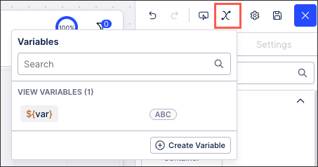 |
To learn more about creating and using View variables, see: Enhanced variables.
User preferences
When previewing your Studio Views using the interactive mode, any View preferences you configure are now kept when you re-enter View edit mode. View preferences are unique to each user and created by their interactions with filters, user specific variables, and components.
View preferences include, but aren't limited to, the following:
Filters
Variables
Component states (such as column sizes and sorting in tables and selecting KPI list cards)
When editing a Studio View, you can see when View preferences are applied by clicking the View preference icon:
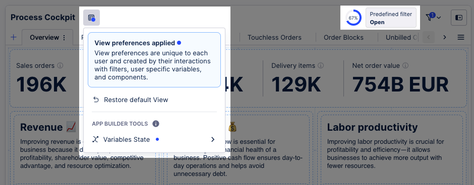 |
You can then click Restore default View to remove these preferences again. To learn more about restoring to your default View, see Restoring default View.
For a video overview of these user preferences features, watch this video:
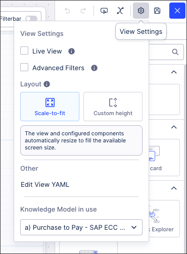
View settings
Your View settings allow you to configure how the data in this View loads and can be interacted with.
The following View settings are available:
Live View: Defines whether the View should check for new Data Model loads. If the Data Model has been reloaded, the View will reload itself automatically (if autoReload: true) or offer to reload the View to not disturb the user flow. You will see the results of this as a note below your View's title informing you about the last reload.
Advanced Filters: Allow users of this View to create their own filters when the View is published. For more about filters, see: Filtering Views.
Layout: Choose between scale-to-fit and custom height. For more about View layouts, see: View layouts
Edit View YAML: Access the YAML editor for this View.
Change Knowledge Model in use: Select an existing KM to base this View on. For more about Knowledge Models, see: Knowledge Models.
 |
For more information about View settings, see: View settings.