Configuring filter components (dropdown, date range, quick filter)
Filter components such as dropdowns, date ranges, and quick filters allow your app users to display time or context specific data. These components work best when combined with charts or tables, relying on visualized data that a user would like to filter down.
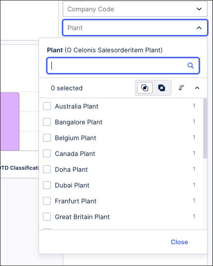
Filter components can either be used directly in a View or combined when creating a filter bar, such as this dropdown filter showing plant locations in an Order Management Starter Kit:
For more information about creating a filter bar, see: Configuring a filter bar for your View.
Filter dropdowns allow app users to filter the data displayed in the current view by selecting from a dropdown list of choices. This filter is based on specific attributes from the Data Model.
In this example, a dropdown filter has been configured for the physical Plant associated with orders. When one or multiple plants are selected in the app (in this case, Belgium and Canada), a filter is applied to the data (and a filter tag added to the view):
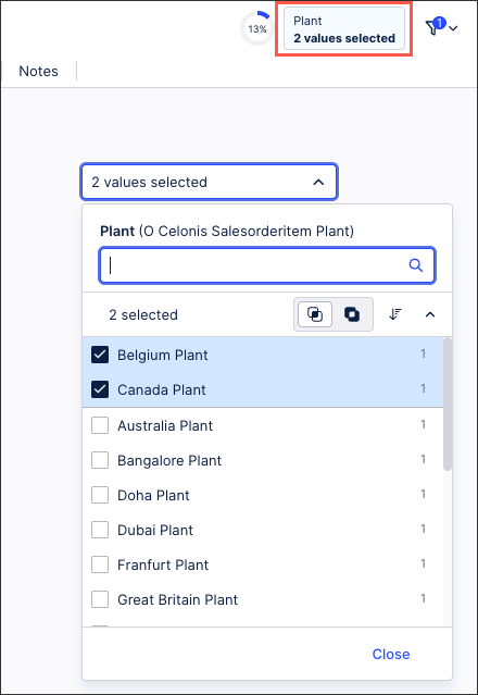
This example has been configured by dragging the Dropdown filter component to the filter bar, adding the dropdown dimension using the PQL editor, and then applying the label 'Plant':
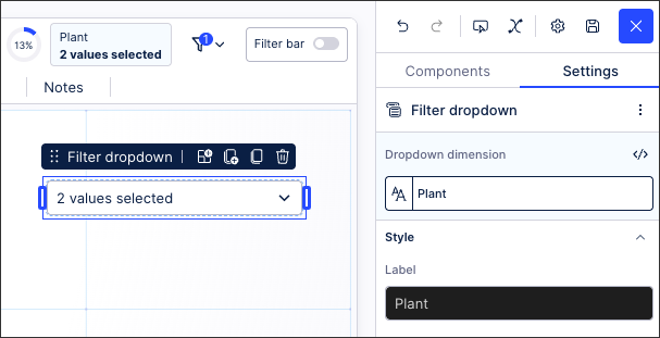
In this example, the PQL statement for the dropdown dimension is:
"o_celonis_SalesOrderItem__Plant"."Name"
The date range filter component allows users to display data based on custom date ranges or by selecting from defined time periods (such as months, years, or all time).
In this example, a data range component has been added to the filter bar of the Order Management Starter Kit. This allows users to filter based on the Sales Order creation dates:
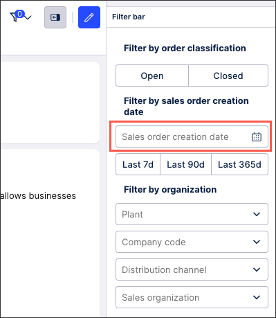 |
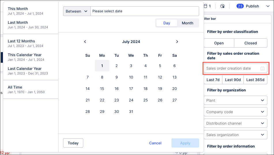
When clicking the creation date filter, the user can then select the time periods:
 |
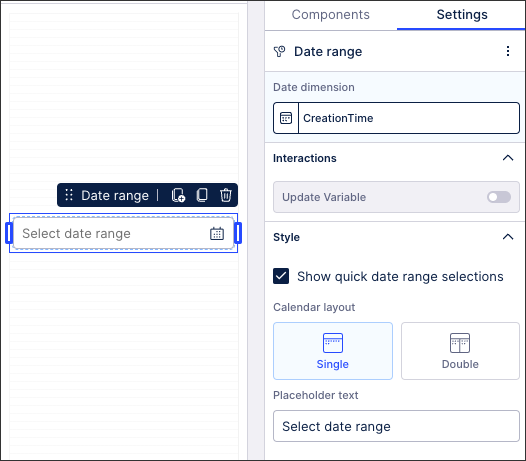
This example has been configured by dragging the Date range component to the filter bar, adding the date dimension using the PQL editor, and then selecting the styling:
In this example, the PQL statement for the date dimension is:
"o_celonis_SalesOrder"."CreationTime"
When configuring the date range component, you have the following options:
Interactions - Update variable: This allows you to select the date variable you want to update and then choose what gets written into the variable. The following four values can be selected: either the start/end date or the formatted start/end date.
Quick date range selections: Selecting this adds the following quick date ranges: This month, last month, last 12 months, this calendar year, last calendar year, and all time
Calendar layout: Choose from displaying a single month or two / double months.
Placeholder text: Enter the empty state message for this component (displayed when no date range has been selected).
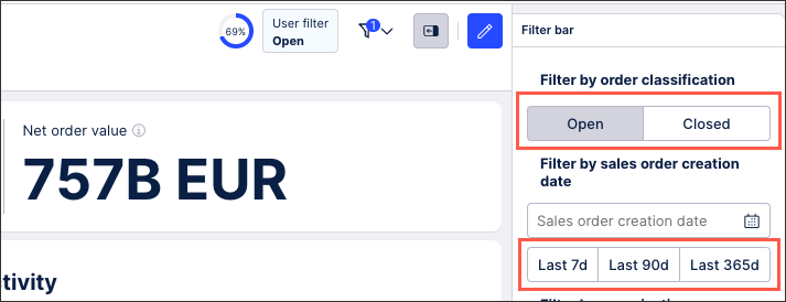
Quick filters allow you to add pre-configured filter buttons to your view or filter bar, allowing a user to click the button to apply that filter to the data.
In this example, two quick filters have been added to the filter bar. A quick filter based on the order classification and a quick filter based on the sales order dates:
The order classification example has been configured by dragging the Quick filter component to the filter bar and then using the filter editor to add filters for Open and Closed orders:
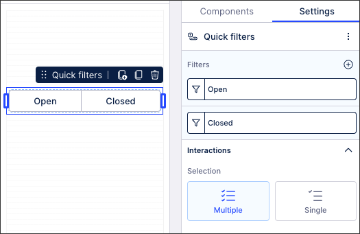
In this example, the filter statements used are:
FILTER @OM_Filter_SalesOrderItem__OpenOrderItems
FILTER @OM_Filter_SalesOrderItem__ClosedOrderItems
And the sales order creation date quick filters have been configured by again dragging the Quick filter component to the filter bar and then using the filter editor to add filters for the Last 7 days, the last 90 days, and the last 365 days.
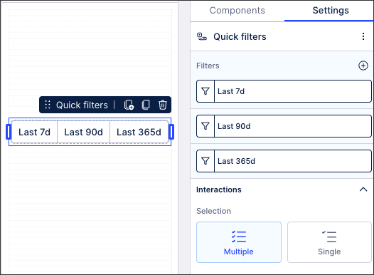
In this example, the filter statements used are:
FILTER @OM_Filter_SalesOrder__CreationTime7D
FILTER @OM_Filter_SalesOrder__CreationTime90D
FILTER @OM_Filter_SalesOrder__CreationTime365D