Configuring user inputs (input box, input dropdown, button)
User inputs such as input boxes, input dropdowns, and buttons allow you to add interactive elements to your View or View filter bar. They can be used to record manually entered values, select values from a list, and to link to other Studio assets or external websites.
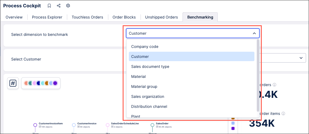
In this example, an input dropdown has been configure to allow the user to select the dimension used when benchmarking two companies:
 |
Input boxes allow you to record a manually entered value from users and then use that value throughout your View. This saves the input as either a View variable or a Knowledge Model variable. This variable can then be used in other components to adjust the View based on the manual value entered by the user.
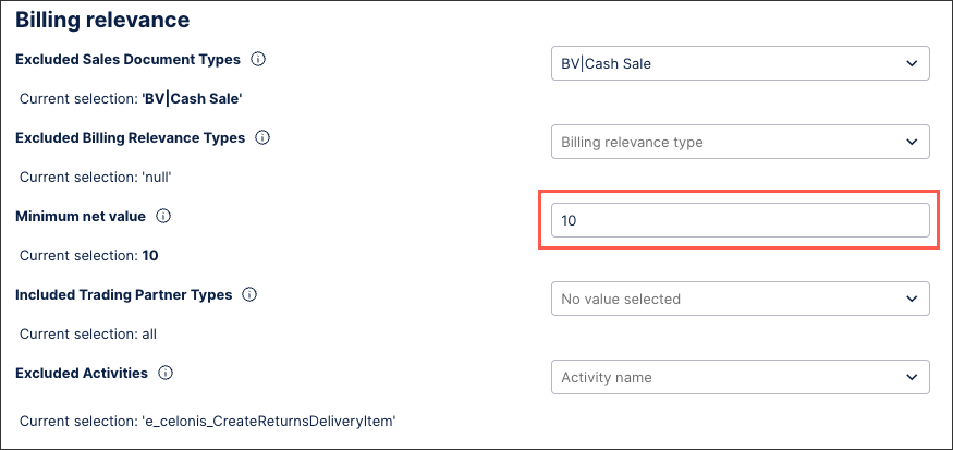
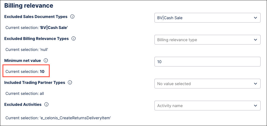
In this example, the input box allows users to enter the minimum net value:
 |
This input box example is configured by saving the user input as a Knowledge Model variable. In this case, the variable is a number type:
${minimum_value_threshold_unbilledcurrency)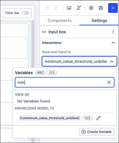 |
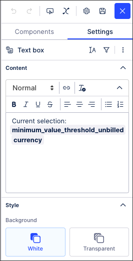
This variable can then be used in other components, such as a text box:
With the published version of the app showing the value entered (10):
 |
Input dropdowns allow users to select from a list of options, with the list either dynamically loaded using PQL statements or configured with manual inputs.
Input dropdowns with loaded inputs
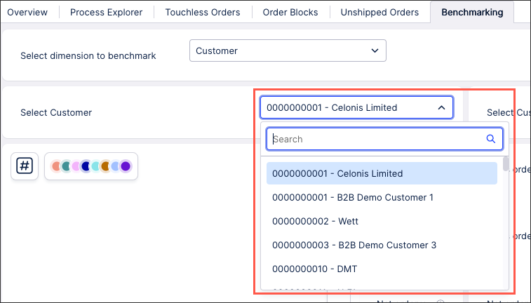
In the following bench marking example, an input dropdown has been configured using entries loaded from the Knowledge Model:
 |
This input dropdown has been configured by creating a PQL statement and saving the user selection to a variable:
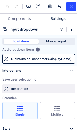
In this example, the PQL statement is:
${dimension_benchmark.displayName}Input dropdowns with manual input
In the same benchmarking example, an input dropdown with manual inputs has been configured to allow the user to select the dimension to benchmark:
|
This input dropdown has been configured by manually adding each dropdown item and labelling them with 'Free text'. We've then also added a variable to save the user selection to:
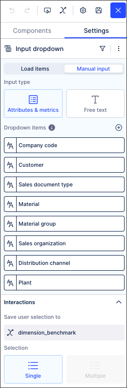
In this example, the PQL statement for the 'Customer' dropdown item is:
"o_celonis_Customer"."CustomerNumberAndName"
You can add clickable buttons to your View, allowing users to either see a linked View as an overlay or directing them to a URL.
Using buttons to display linked Views
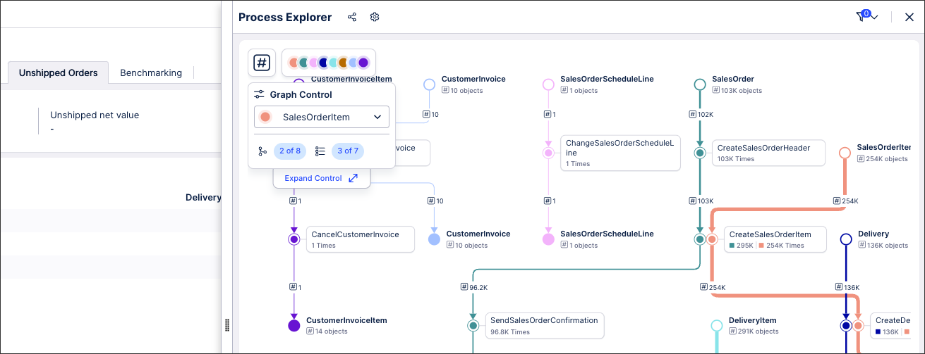
In this Order Management Starter Kit, two buttons have been configured that display linked Views as overlays when clicked:
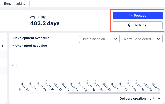 |
For example, by clicking Process, the user can see the Process Explorer for this metric:
 |
For more information about configuring linked Views, see: Linked Views.
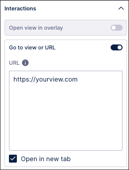
Using buttons to open another View or a URL
You can also configure buttons to open another View or an external Url:
Button styles
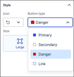
When configuring your buttons, you can select a button icon, button type, and button size (which can also be manually resized within edit mode).
The following icons are available: Add, arrow up, attach, Celonis logo, chevron up, chevon down, chevron left, chevron right, download, edit, filter, hide, idea, info, link, notification, open in new tab, reset, resolve, send email, settings, and show.
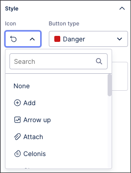
The following button types are available: Primary (blue), secondary (white), danger (red), link (white with blue outline).
In this example, the 'Danger' button has been used to allow users to reset their View to default values:
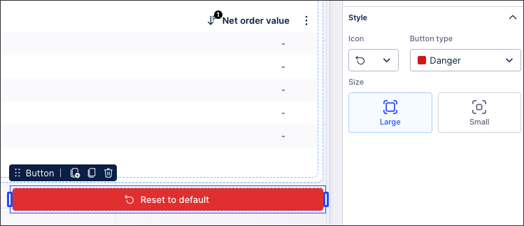 |