Boxplot
You can display your data in a Studio View using either horizontal or vertical boxplot charts. A boxplot chart (sometimes called a box-and-whisker plot) visualizes the distribution of numerical data, making it especially useful for comparing multiple groups. Boxplot charts offer a quick, high-level view of a dataset’s symmetry, skewness, spread, and outliers. With a glance, you can see where most of the values cluster and easily compare patterns between different groups.
Boxplot charts visually summarize the distribution of a data using five key statistics:
Minimum – the smallest value (excluding outliers).
First quartile (Q1) – 25% of data points fall below this.
Median (Q2) – the middle value.
Third quartile (Q3) – 75% of data points fall below this.
Maximum – the largest value (excluding outliers).
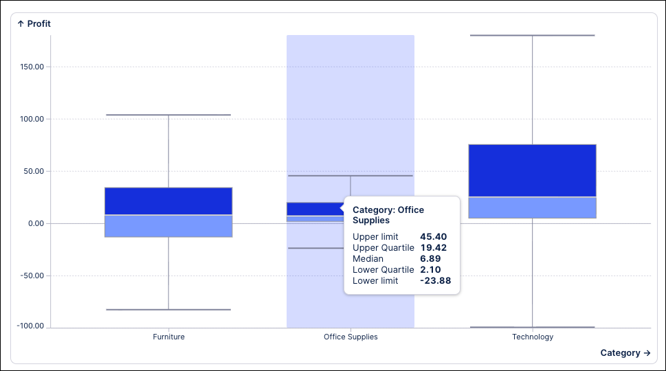
In Studio Views, boxplot charts are configured using a minimum of one metric and one dimension. In this example, the boxplot shows the distribution of profit (Y-axis) across product categories (X-axis):
Using a boxplot chart in your Studio Views can bring the following benefits:
Quick summary of data distribution: Shows the median, spread, and range in one compact graphic.
Easy comparison between groups: Multiple box plots can be placed side-by-side to compare distributions.
Outlier detection: Makes unusual data points immediately visible.
Handles large datasets efficiently: Summarizes thousands of points without plotting each one.
To configure a boxplot chart for your Studio View:
In View Edit Mode, drag and drop the boxplot chart component into your View.
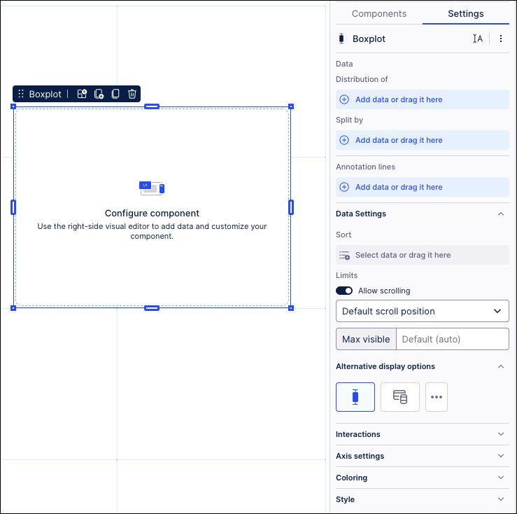
Open the component settings menu and customize your configuration using the following options:
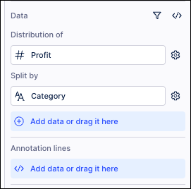
Data: Use the PQL editor to select the data to display in your boxplot chart.
Distribution of: Use the PQL editor to add the metric displayed on the Y-axis. In our example, we've selected profit.
Split by: Use the PQL editor to add the dimension that you want to split the above metric by. In our example, we've selected product categories.
Annotation lines: Used to draw lines on the chart area. This can be useful for highlighting information such as a threshold. You can also choose to display your lines by name, value, or using both.
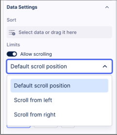
Allow scrolling: When allowing scrolling, you can select where the scrolling start position is by selecting between default, scroll from top, and scroll from bottom.
Alternative display options: Based on your configuration, you may be prompted to try displaying your data using other Studio component types. If you select an alternative type, any configurations made to your chart component will be reset to default.
Interactions: Enable and disable whether users can set temporary filters when interacting with that component. For more information, see: Temporary filters for Apps.
Exclude from predefined filters: When enabled, this removes the component from any filters that are set on a View and tab level.
Exclude from user filtering: When enabled, this prevents the app user from apply a temporary filter to the data within the component.
Can't be used to set filters: When enabled, this prevents the app user from using the component to set temporary filters for the whole View.
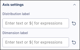
Axis settings: Enter custom distribution and dimension axis labels.
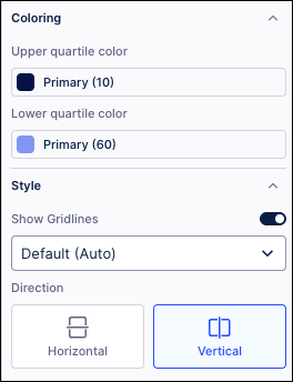
Coloring: Select the colors for your upper and lower quartiles. For recommendations on effective colors, see: Studio coloring best practice.
Style: Choose whether to display the gridlines and the direction of the boxplot (horizontal or vertical).
Click Interactive Mode and preview your chart configuration.
Optional: To see the latest version of your View, deploy the package.