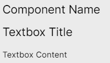
Configuring a textbox in legacy views
Legacy view component
You're currently viewing a topic about a legacy view component in Studio. This component can still be used in legacy Studio views, however we recommend using the visual view editor in the new Studio experience. The updated interface includes drag and drop capabilities, allowing you to easily add components and configure your views.
For more information, see: Views.
Add customizable text to your view, using both text and HTML formatting.
 |
Basic textbox configuration
To configure a basic textbox component, the following attributes are available:
Note
Your textbox must contain at least one of the title or content attributes to work.
Attribute | Required | Type | Description | |
|---|---|---|---|---|
name | No | String | Defines the component name that will be displayed at the top of the textbox.
| |
title | No | String | Defines the title that should be displayed above the textbox content.
| |
content | No | String | Defines the content that should be displayed within the textbox component.
|
And the YAML example for a basic textbox:
- id: "textBox1"
  type: "text-box"
  settings:
    title: "Title of the text box"
    content: "Text in the text box"
Advanced textbox configuration
To configure an advanced textbox component, the following attributes are also available:
Attribute | Required | Type | Description |
|---|---|---|---|
placeholders | No | String | Defines attributes, KPIs, or variables from your knowledge model that you want to reference in the textbox content. Once these have been defined in your parameter configuration, you can use them in your textbox by referencing them using the format "Placeholder {X}" where "X" is the order placement you listed it in. Note When referencing the parameter in the text field, the ordering reference should start at {0}. Therefore, if you have three fields listed, you can reference these as :
|
And the YAML example for an advanced textbox:
- id: "textBox4"
  type: "text-box"
  settings:
    title: Textbox Component
    content: This is an example textbox <br/> component you can make use of in your
         views. In this text box you can do things such as <ul><li> Create bulleted
         list </li><li><code>Insert Code Snippets</code></li><li>Reference Attributes
         or KPIs from your Knowledge Model. For example, The avg. number of open
         invoices is Placeholder {0} <br/> </li><li>And many more!
    placeholders:
      - field: NUMBER_OF_OPEN_INVOICES
Additional HTML design elements
Additional Design Properties | Description |
|---|---|
HTML Elements | Defines additional stylist properties using HTML elements within the content configurations. Some HTML elements used in the example above:
Further HTML elements can be used such as e.g.: <code> <p> <hr> <ul> <ol> <li> <a> <b> <i><div> If you are new to HTML, we recommend the following external resource. |
