Configuring a time filter in legacy views
Legacy view component
You're currently viewing a topic about a legacy view component in Studio. This component can still be used in legacy Studio views, however we recommend using the visual view editor in the new Studio experience. The updated interface includes drag and drop capabilities, allowing you to easily add components and configure your views.
For more information, see: Views.
The Time Filter component allows you to select and filter data based on specific date ranges. Users can easily navigate through time-based data and explore trends, patterns, and insights across different time periods. The component offers several advanced capabilities such as convenient quick selections, flexibility to choose ranges in days or months, and the ability to write your selection into a variable.
Basic time filter configuration
To configure a basic Time Filter Component, you must have at least the following features defined:
name: Component Name
id: time-filter-b30c5788-7a7a-4882-9f58-3f4579360742
type: time-filter
settings:
     dateAttribute: ACTIVITY.EVENTTIME
Attribute | Required | Type | Description |
|---|---|---|---|
dateAttribute | true | References a date attribute defined in the Knowledge Model. | |
name | false | String | Defines the name that will be displayed on the top left corner of the component. |
Advanced time filter configuration
In addition to the basic configuration the following additional configuration options are also available.
id: time-filter-b3a9eff8-f02d-4d9d-a342-b07c35388b6e
type: time-filter
settings:
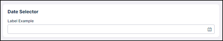
name: Date Selector
dateAttribute: SALESDATA_XLSX_ORDERS_AUGMENTED_CLOSED_DATE.CHANGE_DATE
mode: double
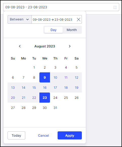
dateFormat: "%d-%m-%Y"
onChange:
update:
variables:
startDate: <DUMMY_VARIABLES>
endDate: <DUMMY_VARIABLES>
label: Change Date
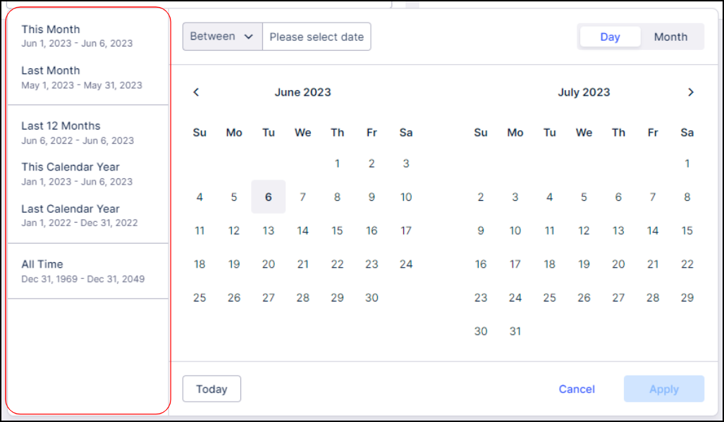
quickDateSelections: true
styles:
position:
horizontal: center
vertical: centerNote
Default values are in bold below.
Attribute | Required | Type | Possible value | Description | |
|---|---|---|---|---|---|
label | false | string | - | Defines a custom label that should be displayed.
| |
dateFormat | false | date | "%Y-%m-%d" "%d-%m-%Y" "%m-%d-%Y" | Defines the date format in which the selected date will be displayed. | |
quickDateSelections | false | boolean | true false | Defines if predefined quick date selections will be displayed in the component.
| |
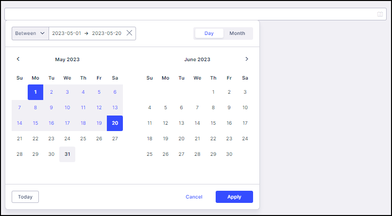
mode | false | boolean | double single | Defines the display mode that will be used. Selecting "double" will show two months simultaneously, while choosing "single" will display only one month for a more condensed view (see screenshot below).
| |
styles | - | - | - | Contains the styling options. | |
horizontal | false | full right center left | full right center left | Defines the horizontal alignment of the component. | |
vertical | false | top center bottom | top center bottom | Defines the vertical position within the given layout. | |
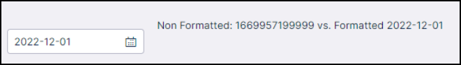
onChange update variables endDate: startDate: formattedEndDate: formattedStartDate: | false | Variable | Defines the variable into which the selected value will be written. You can then make use of the variable in different components. Note Use the formatted YAML option if you prefer the variable to be updated in the same format as presented in the component display.
|