Configuring an input checkbox for legacy views
Legacy view component
You're currently viewing a topic about a legacy view component in Studio. This component can still be used in legacy Studio views, however we recommend using the visual view editor in the new Studio experience. The updated interface includes drag and drop capabilities, allowing you to easily add components and configure your views.
For more information, see: Views.
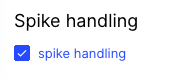
Add a labeled checkbox to your view, enabling users to click a box to activate or deactivate a feature.
 |
Basic input checkbox configuration
To configure a basic input checkbox component, the following attributes are available:
Attribute | Required | Type | Description |
|---|---|---|---|
label | Yes | String | Defines the label text of the checkbox. |
onChange: update: variables: - name: | Yes |
| Defines a unique identifier for the field. It gets auto-generated if not defined. It is important in context of Base and Extension. |
activated | Yes | String | Defines the value which should be written into the value in case the checkbox is activated. |
deactivated | Yes | String | Defines the value which should be written into the value in case the checkbox is deactivated. |
The example YAML for a basic input checkbox component:
id: input-checkbox-76da9873-2f1f-4e52-96f8-91f8ac27f15f
type: input-checkbox
settings:
  label: Label
  onChange:
    update:
      variables:
        - name: variable_name
          activated: activated
          deactivated: deactivated
You can also use a checkbox inside another component. To do this, here is an example YAML:
- id: embeddedView
  type: view
  settings:
    key: your-view-key
    shareFilters: ${(checkboxValue === 'checked' && "true") || (checkboxValue === 'unchecked' && "false"}
In this example, you would allow a user to choose with the help of the checkbox if the filters of an embedded view should be shared with the view it is embedded.
Advanced input checkbox configuration
To configure an advanced input checkbox component, the following attributes are available:
Attribute | Required | Type | Possible values | Default Value | Description |
|---|---|---|---|---|---|
styles | No | Defines the different styles you can apply to the component. | |||
position | No | Defines that the position of the component within the given layout. | |||
horizontal | No | Enum | full left center right | full | Defines the horizontal alignment position within the given layout. |
vertical | No | Enum | top center bottom | bottom | Defines the vertical alignment position with the given layout. |
isChecked | No | Boolean | true false | false | Defines if the Checkbox should be checked on page load. |
The example YAML for an advanced input checkbox component:
id: input-checkbox-76da9873-2f1f-4e52-96f8-91f8ac27f15f
type: input-checkbox
settings:
  styles:
    position:
      horizontal: full
      vertical: bottom
  isChecked: true
  label: Label
  onChange:
    update:
      variables:
        - name: variable_name
          activated: activated
          deactivated: deactivated