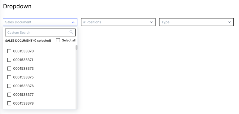
Configuring dropdowns in legacy views
Legacy view component
You're currently viewing a topic about a legacy view component in Studio. This component can still be used in legacy Studio views, however we recommend using the visual view editor in the new Studio experience. The updated interface includes drag and drop capabilities, allowing you to easily add components and configure your views.
For more information, see: Views.
Adding dropdowns allow you to filters your views based on attributes or changing input variables.

Basic dropdowns configuration
When configuring basic dropdowns in your views, the following attributes are available:
Attribute | Required | Type | Description |
|---|---|---|---|
attribute | Yes | Record.Attribute Custom Object | References objects defined in the Knowledge Model. Important In many use cases the record must have an identifier defined to use properly. |
id | Yes | String | Defines a unique identifier for the field. It gets auto-generated if not defined. It is important in the context of Base and Extension. |
order | Yes | Integer | Defines the order of the table column. Gets auto-generated if not defined. It is important in context of Base and Extension. |
The example YAML for configuring basic dropdowns in your views:
id: dropdown
type: dropdown-list
settings:
        data:
                columns:
            - attribute: RECORD.ATTRIBUTE1
                          id: 100
                          order: 100
            - attribute: RECORD.ATTRIBUTE2
                          id: 200
                          order: 200
Advanced dropdowns configuration
When configuring more advanced dropdowns in your views, the following attributes are available:
Attribute | Required | Type | Possible values | Default Value | Description |
|---|---|---|---|---|---|
floatingPlaceholder | No | Boolean | true false | false | Defines that Strings are automatically left and numbers and timestamps right aligned. |
styles | No | Enum | overflow styles | Contains different styling options such as overflow or styles. | |
overflow | No | Enum | full-width line-break scroll | full-width | Defines the orientation of a list of dropdowns when the width of the selected dropdowns exceeds the component size. |
styles | No | Enum | horizontal vertical | - | Contains different style options such as horizontal and vertical alignment. |
horizontal | No | Enum | full right center left | full | Defines the horizontal alignment of the component. |
vertical | No | Enum | top center bottom | bottom | Defines the vertical alignment of the component. |
displayName | No | String | Defines a display Name that should be displayed instead. | ||
selected | No | String | DEPRECATED - Defines the options which should be selected up-on page load. | ||
scope | No | Enum | disabled hidden immutable | Defines the scope of the dropdown option. This can be used in the context of base and extension. | |
onClick update | No | Boolean | title list | list | Defines an onclick variable update action. |
variables: - name | No |
| - | - | Defines the variable into which the selected value will be written. You can then make use of the variable at different components. |
selection | No | Boolean | single multiple | single | Defines if the dropdown should be single or multi-select when updating the variable value. |
The example YAML for an advanced dropdown configuration:
id: dropdown
type: dropdown-list
settings:
        floatingPlaceholder: true
    styles:
        overflow: full-width
        position:
                        horizontal: right
                        vertical: center
        data:
                columns:
            - attribute: RECORD.ATTRIBUTE1
                          id: 100
                          order: 100
            - attribute: RECORD.ATTRIBUTE2
                          id: 200
                          order: 200
                          displayName: CustomName
                          scope: hidden
                  onClick:
                update:
                        variables:
                                - name: <DUMMY_VARIABLES>